


FMP Historical Price APIs: From Light Charts to Dividend-Adjusted Analysis
Imagine a quant developing a backtesting workflow to evaluate a straightforward momentum strategy over ten years of end‑of‑day (EOD) price data. The endpoints that provide historical daily data are the heart of the process, offering synchronized closes, volumes, and adjusted prices that make research or integration straightforward. Whether you're a developer creating financial charts, a quant fine-tuning signals, or a fintech professional improving dashboards, these endpoints give you reliable, well-organized access to the market's daily flow.
End‑of‑day data captures each day's open, high, low, close, and volume (OHLCV), creating a consistent and clear view of market activity. Many analysts use it for backtests because it smooths out intraday noise while highlighting important price trends. Compared with intraday or weekly data, EOD offers a perfect balance between detail and ease of use, making it an excellent foundation for portfolio research and long‑term strategy planning.
Endpoints Overview
FMP provides multiple endpoints delivering this data in different formats, supporting key analysis needs. Let's explore each of them individually.
First is the Stock Chart Light API, which provides simplified stock chart data for some basic analysis. To call the specific endpoint, you will need:
- api-key: your api key
- symbol: the symbol you are interested in. In the example Python code below, we will request the stock quote of Apple stock (AAPL)
- from and to: the period that you want to get the data
The Python code you need is provided below. We import the necessary libraries at the beginning so copying this into a Jupyter notebook will work smoothly.
|
import requests import pandas as pd import matplotlib.pyplot as plt import mplfinance as mpf import matplotlib.dates as mdates import numpy as np import json token = 'YOUR FMP TOKEN' symbol = 'AAPL' from_date = '2025-01-01' to_date = '2025-12-31' url = f'https://financialmodelingprep.com/stable/historical-price-eod/light' querystring = {"apikey":token, "symbol":symbol, "from":from_date, "to":to_date} resp = requests.get(url, querystring).json() |
Note: Replace ‘YOUR FMP API KEY' with your secret FMP token. If you don't have one, you can obtain it by opening an FMP developer account.
The response is a list of dictionaries as shown below:
|
{ 'symbol': 'AAPL', 'date': '2025-12-31', 'price': 271.86, 'volume': 27293639 } |
It is quite straightforward. We have the date, the closing price for that day, and the volume in stocks.
While the above endpoint provides a single price data point, a more detailed option is the Stock Price and Volume Data API. You can call it as shown below:
|
symbol = 'AAPL' from_date = '2025-01-01' to_date = '2025-12-31' url = f'https://financialmodelingprep.com/stable/historical-price-eod/full' querystring = {"apikey":token, "symbol":symbol, "from":from_date, "to":to_date} resp = requests.get(url, querystring).json() |
The response is once again a list of dictionaries, as shown below:
|
{'symbol': 'AAPL', 'date': '2025-12-31', 'open': 273.06, 'high': 273.68, 'low': 271.75, 'close': 271.86, 'volume': 27293639, 'change': -1.2, 'changePercent': -0.43946, 'vwap': 272.5875} |
As you can see, besides the usual Open, High, Low, Close, Volume (OHLCV) data, the endpoint provides:
- change: the daily change of the stock (in currency)
- changePercent: the daily change in percentage
- vwap: the vwap technical indicator
The next API is the Unadjusted Stock Price API, providing historical price data without adjustments. Unlike adjusted series, this data is directly affected by stock splits, meaning you will see the mechanical price drops or jumps associated with corporate actions. This endpoint is your go-to source when you need the ‘as-stated' historical price (the exact value the stock traded at on a specific day in the past).
|
symbol = 'AAPL' from_date = '2025-01-01' to_date = '2025-12-31' url = f'https://financialmodelingprep.com/stable/historical-price-eod/non-split-adjusted' querystring = {"apikey":token, "symbol":symbol, "from":from_date, "to":to_date} resp = requests.get(url, querystring).json() |
With a response of:
|
{'symbol': 'AAPL', 'date': '2025-12-31', 'adjOpen': 273.06, 'adjHigh': 273.68, 'adjLow': 271.75, 'adjClose': 271.86, 'volume': 27293639} |
The response closely resembles the previous one, with OHLCV data points, the only difference being that the prices are unadjusted because splits are not factored in.
The final endpoint discussed in this article is the Dividend Adjusted Price Chart API, which modifies the price by accounting for dividends.
|
symbol = 'AAPL' from_date = '2025-01-01' to_date = '2025-12-31' url = f'https://financialmodelingprep.com/stable/historical-price-eod/dividend-adjusted' querystring = {"apikey":token, "symbol":symbol, "from":from_date, "to":to_date} resp = requests.get(url, querystring).json() |
The response looks like the following:
|
{'symbol': 'AAPL', 'date': '2025-12-31', 'adjOpen': 272.81, 'adjHigh': 273.43, 'adjLow': 271.5, 'adjClose': 271.61, 'volume': 27293639} |
This matters because dividend adjusted prices are not the literal traded price. They are a total return style series that backs dividends into the price path, which is what you want when you are measuring long run performance or backtesting.
Now, let's examine some use cases for what you can do with the mentioned endpoints.
Simple Closing Prices
We will begin with the simplest of all. We will obtain Apple stock prices for 2025 and plot them on a line chart.
|
symbol = 'AAPL' from_date = '2025-01-01' to_date = '2025-12-31' url = f'https://financialmodelingprep.com/stable/historical-price-eod/light' querystring = {"apikey":token, "symbol":symbol, "from":from_date, "to":to_date} resp = requests.get(url, querystring).json() df = pd.DataFrame(resp) df.sort_values('date', inplace=True) df.plot(x='date', y='price') |
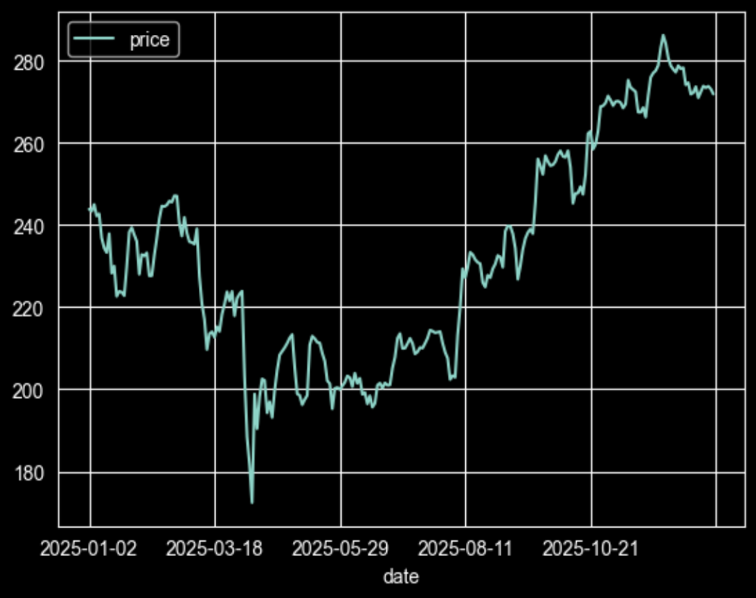
As you can see, with just a few lines of code, we get a clear plot of how Apple stock performed in 2025, with a disappointing first four months, then rebounding and reaching new highs by the end of 2025.
Let's Add More Stocks to the Plot
The next use case is quite important, as it will demonstrate how you can add more than one stock to the same plot, enabling comparison. The challenging part is that each stock has a different price range, so to create a meaningful plot, we will need to normalise them.
|
symbols = ["AAPL", "MSFT", "GOOGL", "AMZN", "META"] from_date = '2025-01-01' to_date = '2025-12-31' dfs = [] for symbol in symbols: querystring = {"apikey":token, "symbol":symbol, "from":from_date, "to":to_date} resp = requests.get(url, params=querystring).json() df = pd.DataFrame(resp) # keep only date + price, sort, and rename column to symbol df = df[["date", "price"]].sort_values("date") df["date"] = pd.to_datetime(df["date"]) df.rename(columns={"price": symbol}, inplace=True) df.set_index("date", inplace=True) dfs.append(df) # combine all symbols on date index prices = pd.concat(dfs, axis=1).sort_index() # normalize: divide by first value of each series norm_prices = prices / prices.iloc[0] # plot ax = norm_prices.plot(figsize=(10, 6)) ax.set_title("Normalized prices for 5 stocks") ax.set_xlabel("Date") ax.set_ylabel("Normalized price (t / t0)") plt.tight_layout() plt.show() |
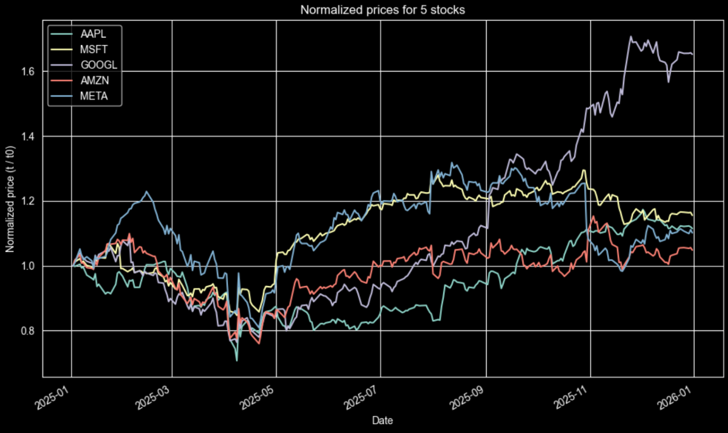
You can see that all the stocks start from the same point in the beginning of 2025. This allow us with a quick look to understand a few things in the plot for 2025:
- Google outperformed all of them.
- Meta and Microsoft moved quite similarly, outperforming all stocks until mid-2025, before Google took the lead.
- Amazon and Apple also moved similarly with Google until May, but after that they did not manage to rise as much as the others.
Beyond Just Prices
In the next use case, we will demonstrate a basic calculation of technical indicators and how to plot them on the same chart. We will include a fast simple moving average (50 periods) and a slow one (200 periods). This approach is commonly used to assess momentum.
For this example, we'll be using the mplfinance library, which is great for making financial plots. It makes creating candlestick charts a breeze. You'll also see that we include prices for 2024 and 2025, giving the indicators some extra room to be calculated correctly. For example, the 200SMA needs the first 200 days to gather enough data before it can start giving meaningful results.
|
symbol = "AAPL" from_date = '2024-01-01' to_date = '2025-12-31' url = "https://financialmodelingprep.com/stable/historical-price-eod/full" querystring = {"apikey": token, "symbol": symbol, "from": from_date, "to": to_date} resp = requests.get(url, params=querystring).json() df = pd.DataFrame(resp) df["date"] = pd.to_datetime(df["date"]) df = df.sort_values("date").set_index("date") # calculate SMAs df["sma50"] = df["close"].rolling(50).mean() df["sma200"] = df["close"].rolling(200).mean() df_recent = df["2025-01-01":"2025-12-31"] # plot mpf.plot(df_recent[['open','high','low','close']], type='candle', addplot=[ mpf.make_addplot(df_recent["sma50"], color="blue", width=1, panel=0, ylabel="SMA50"), mpf.make_addplot(df_recent["sma200"], color="red", width=1, panel=0, ylabel="SMA200") ], title=f"{symbol} - SMA50(blue)/SMA200(red)", ylabel='Price ($)', figsize=(14,8), style='yahoo') |
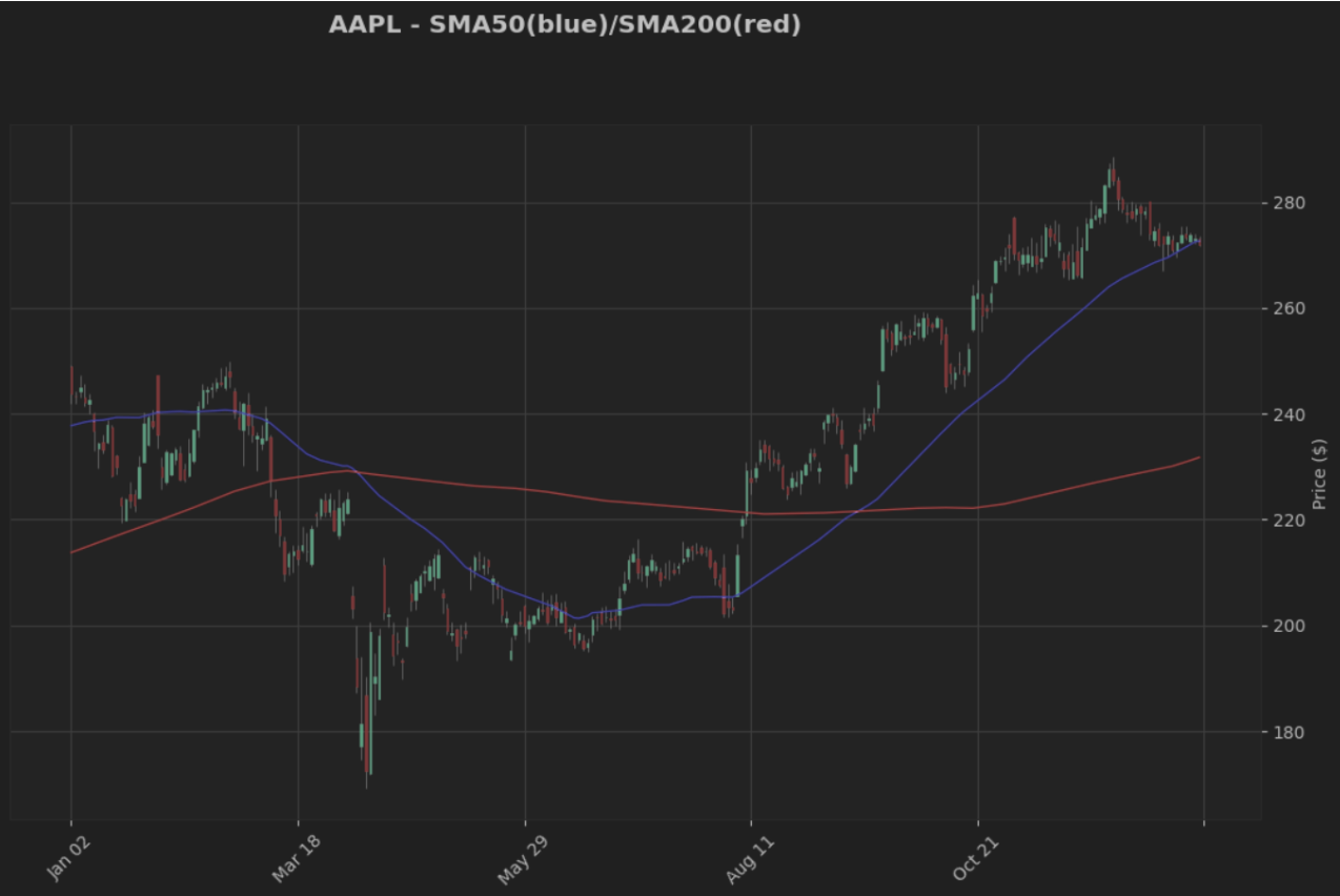
As you observe until March, Apple stock was on an uptrend (50SMA was higher than 200SMA), crossing over at that time and then entering a downtrend. The next crossover occurred around September, where the momentum reversed again, and Apple stock began reaching new highs.
Dividend Time
An intriguing idea is to look at the dividend-adjusted prices and see the dividends on the days they were announced. Let's explore this together for 2024 and 2025! We will the FMP's Dividends Company API so we get the historical dividends over time.
|
symbol = 'AAPL' from_date = '2024-01-01' to_date = '2025-12-31' # 1. Get historical prices url_prices = 'https://financialmodelingprep.com/stable/historical-price-eod/dividend-adjusted' q_prices = {"apikey": token, "symbol": symbol, "from": from_date, "to": to_date} prices = requests.get(url_prices, params=q_prices).json() # 2. Get dividends url_divs = 'https://financialmodelingprep.com/stable/dividends' # or /dividends q_divs = {"apikey": token, "symbol": symbol} dividends = requests.get(url_divs, params=q_divs).json() # Prepare prices df_p = pd.DataFrame(prices) df_p['date'] = pd.to_datetime(df_p['date']) df_p = df_p.sort_values('date') price_dates = df_p['date'].tolist() adj_close = df_p['adjClose'].tolist() # Prepare dividends (skip date filtering initially to see all) df_d = pd.DataFrame(dividends) df_d['declarationDate'] = pd.to_datetime(df_d['declarationDate']) # Filter by date range df_d = df_d[ (df_d['declarationDate'] >= from_date) & (df_d['declarationDate'] <= to_date) ].reset_index(drop=True) # Create plot fig, ax = plt.subplots(figsize=(14, 8)) # Plot adjClose line ax.plot(price_dates, adj_close, linewidth=2.5, color='#1f77b4', label='Adj Close') # Add arrows at declaration dates if not df_d.empty: for _, row in df_d.iterrows(): decl_date = row['declarationDate'] # Find closest trading day closest_idx = (df_p['date'] - decl_date).abs().idxmin() x_val = df_p.iloc[closest_idx]['date'] y_val = df_p.iloc[closest_idx]['adjClose'] div_val = row['dividend'] yld = row['yield'] * 100 if row['yield'] < 1 else row['yield'] ax.annotate( f'Div: ${div_val:.2f}\nYield: {yld:.1f}%', xy=(x_val, y_val), xytext=(15, 15), textcoords='offset points', arrowprops=dict( arrowstyle='->', color='red', lw=2, mutation_scale=20 ), bbox=dict( boxstyle='round,pad=0.4', facecolor='yellow', alpha=0.4, edgecolor='orange' ), fontsize=10, fontweight='bold', ha='left' ) # Formatting ax.set_xlabel('Date', fontsize=12) ax.set_ylabel('Adjusted Close Price ($)', fontsize=12) ax.set_title(f'{symbol} Adjusted Close with Dividend Declarations\n({from_date} to {to_date})', fontsize=14, fontweight='bold') ax.legend() ax.grid(True, alpha=0.3, linestyle='--') # Date formatting ax.xaxis.set_major_formatter(mdates.DateFormatter('%Y-%m-%d')) ax.xaxis.set_major_locator(mdates.MonthLocator(interval=2)) plt.setp(ax.xaxis.get_majorticklabels(), rotation=45) plt.tight_layout() plt.show() |
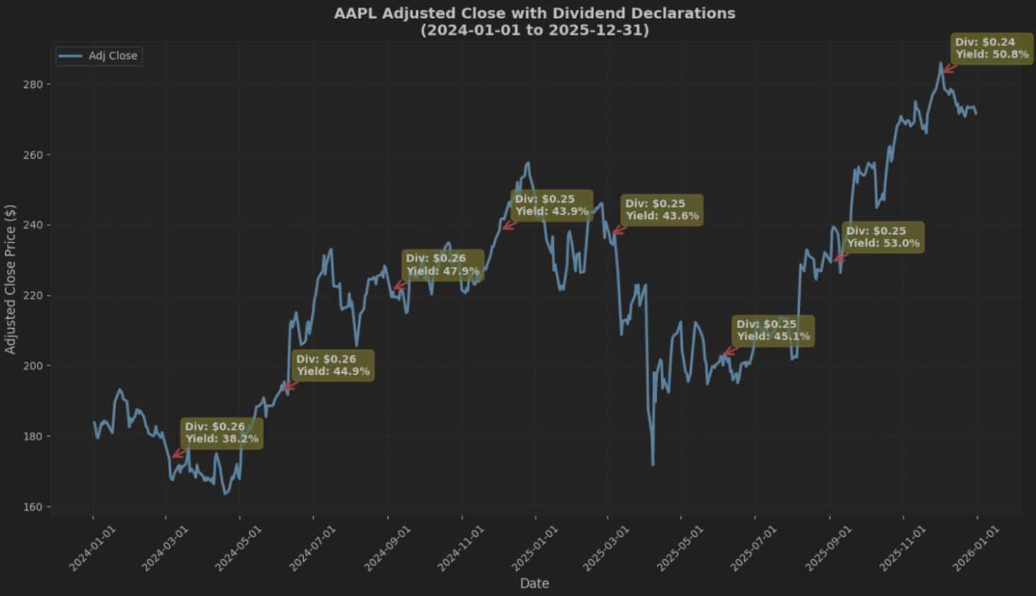
This plot is useful because the dips you see around dividend dates are mechanical adjustments from the dividend and split handling, not a market sell off reaction. It gives you a cleaner total return style series for analysis.
Do Financial Ratios Matter?
Now, we will combine the prices with Apple's historical financial ratios. The FMPs Financial Ratios API provides a wide range of ratios. In our example, we will compare price to operating profit margin; however, you can use any ratio from the endpoint to investigate how it affects the returns.
|
isymbol = 'AAPL' from_date = '2020-01-01' to_date = '2025-12-31' ratio = "operatingProfitMargin" # Fetch data (same as before) url_price = 'https://financialmodelingprep.com/stable/historical-price-eod/light' params_price = {"apikey": token, "symbol": symbol, "from": from_date, "to": to_date} prices = requests.get(url_price, params=params_price).json() url_ratios = 'https://financialmodelingprep.com/stable/ratios' params_ratios = {"apikey": token, "symbol": symbol} ratios = requests.get(url_ratios, params=params_ratios).json() # Aggregate with None handling years = np.array(list(range(2020, 2026))) # numpy for NaN support avg_prices = [] net_margins_pct = [] for year in years: year_prices = [p for p in prices if p['date'].startswith(str(year))] avg_price = np.mean([p['price'] for p in year_prices]) if year_prices else np.nan avg_prices.append(avg_price) year_ratio = next((r for r in ratios if r.get('fiscalYear') == str(year)), None) net_margin = year_ratio[ratio] * 100 if year_ratio else np.nan net_margins_pct.append(net_margin) avg_prices = np.array(avg_prices) net_margins_pct = np.array(net_margins_pct) # Plot fig, ax1 = plt.subplots(figsize=(10, 6)) # Line: avg price color = 'tab:blue' ax1.set_xlabel('Year') ax1.set_ylabel('Avg Price ($)', color=color) line1 = ax1.plot(years, avg_prices, color=color, marker='o', linewidth=2, label='Avg Price') ax1.tick_params(axis='y', labelcolor=color) ax1.grid(True, alpha=0.3) # Bar: net margin (mask NaN) ax2 = ax1.twinx() color = 'tab:green' valid_mask = ~np.isnan(net_margins_pct) bars = ax2.bar(years[valid_mask], net_margins_pct[valid_mask], color=color, alpha=0.7, label='Net Margin (%)') # After ax2.bar(...), add these lines for tight y2 range: margin_min = np.nanmin(net_margins_pct) margin_max = np.nanmax(net_margins_pct) margin_range = margin_max - margin_min ax2.set_ylim(margin_min - 0.2 * margin_range, margin_max + 0.7 * margin_range) # 10% padding ax2.tick_params(axis='y', labelcolor=color) ax2.set_ylabel(ratio, color=color) # Formatting plt.title(f'AAPL Yearly Avg Price vs {ratio} (2020-2025)') fig.tight_layout() fig.legend(loc='upper center', bbox_to_anchor=(0.5, -0.05), ncol=2) plt.savefig('aapl_price_margin_fixed.png', dpi=300, bbox_inches='tight', facecolor='white') # Metadata with open('aapl_price_margin_fixed.png.meta.json', 'w') as f: json.dump({"caption": "AAPL 2020-2025 Price & Margin (Fixed)"}, f) plt.show() |
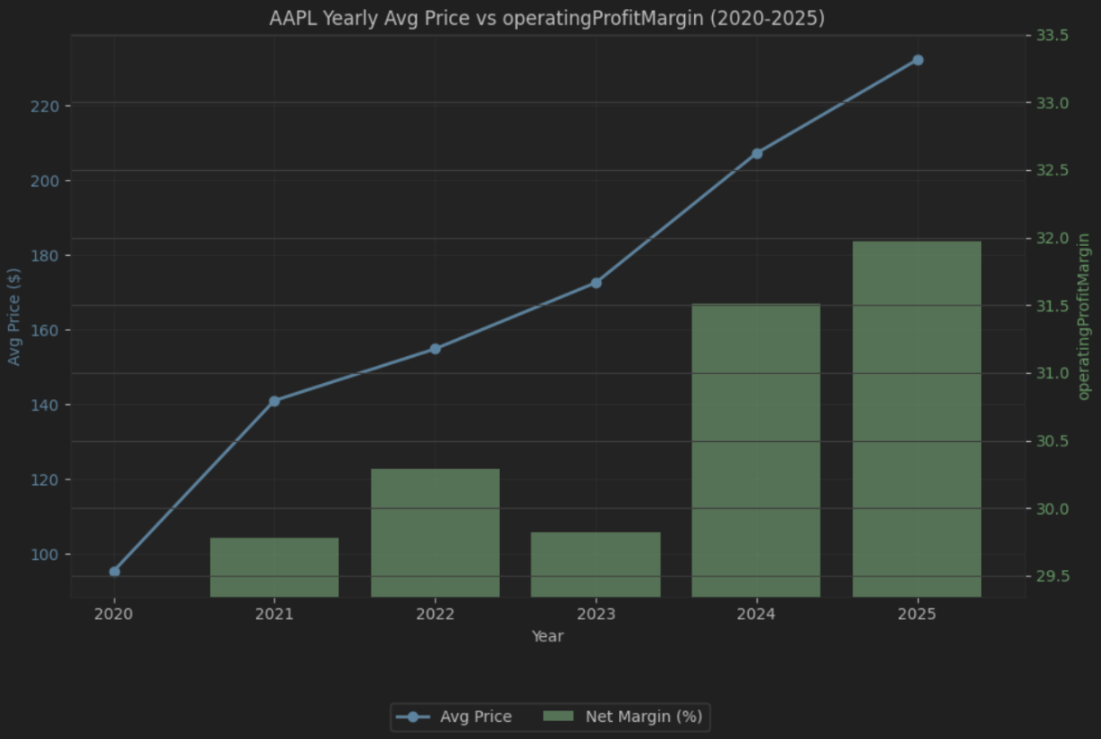
From this plot, you can see that the biggest price runs happened during the same stretches where operating margin was improving. In 2023, margin cooled off and the price move was comparatively flatter too. That does not prove margins drove the move, but it is a useful diagnostic lens. It helps you spot periods where fundamentals and price action look like they are moving together, and then decide what is worth digging into next. If you want to explore a different angle, you can swap the ratio in the code and rerun the same comparison.
Backtesting Strategies
One of the main uses of historical prices is also backtesting our strategies. As every savvy investor, before putting actual money into an investment strategy, you need to check historically what this strategy would have actually returned.
In the example below, we will backtest a simple cross moving averages strategy. The premise of this is to identify momentum using a fast and a slow moving average. When the fast is above the slow, we assume that the stock is uptrending, while in the opposite setup, there is a downtrend.
To accomplish this, you'll notice we follow the steps outlined below:
- Get the prices of the stock
- Calculate the two moving averages
- Calculate a column named signal based on the logic we just described (1 if short > long, else -1)
- Then calculate the actual percentage with the signal. This means that if the stock was trending upwards, we will receive the daily returns as normal since we were going to be invested long. However, if we are invested short (-1), we will get positive returns when the stock has negative ones.
- Then we calculate our equity curve assuming that our initial capital is 100
- We also calculate the Buy and Hold strategy (what if we bought the stock at the beginning and just kept it), which is the most common benchmark of a strategy.
- Finally, we plot the results.
|
symbol = 'AAPL' from_date = '2020-01-01' to_date = '2025-12-31' url = f'https://financialmodelingprep.com/stable/historical-price-eod/full' # Correct endpoint for daily EOD params = {'from': from_date, 'to': to_date, 'apikey': token, "symbol": symbol} # Fetch data resp = requests.get(url, params=params).json() df = pd.DataFrame(resp) df['date'] = pd.to_datetime(df['date']) df.set_index('date', inplace=True) df.sort_index(inplace=True) df = df[['open', 'high', 'low', 'close', 'volume', 'changePercent']].rename(columns={'close': 'Close'}) # Standardize # SMAs on Close df['SMA_50'] = df['Close'].rolling(window=50).mean() df['SMA_200'] = df['Close'].rolling(window=200).mean() # Signal: 1 if short > long, else -1 df['signal'] = np.where(df['SMA_50'] > df['SMA_200'], 1, -1) df['dailyReturn'] = df['signal'].shift(1) * df['changePercent'] # Equity curves after warmup (skip first 200 days) warmup = 200 df_strategy = df.iloc[warmup:].copy() df_strategy['strategy_equity'] = 100 * (1 + df_strategy['dailyReturn'] / 100).cumprod() df_strategy['bnh_equity'] = 100 * df_strategy['Close'] / df_strategy['Close'].iloc[0] fig, ax = plt.subplots(figsize=(12, 6)) ax.plot(df_strategy.index, df_strategy['strategy_equity'], label='SMA(50/200) Strategy', linewidth=2) ax.plot(df_strategy.index, df_strategy['bnh_equity'], label='Buy & Hold', linewidth=2, linestyle='--', alpha=0.9) ax.set_title(f'{symbol} Equity Curve: Strategy vs Buy & Hold (Base=100)') ax.set_xlabel('Date') ax.set_ylabel('Equity') ax.grid(True, alpha=0.3) ax.legend() plt.tight_layout() plt.show() |
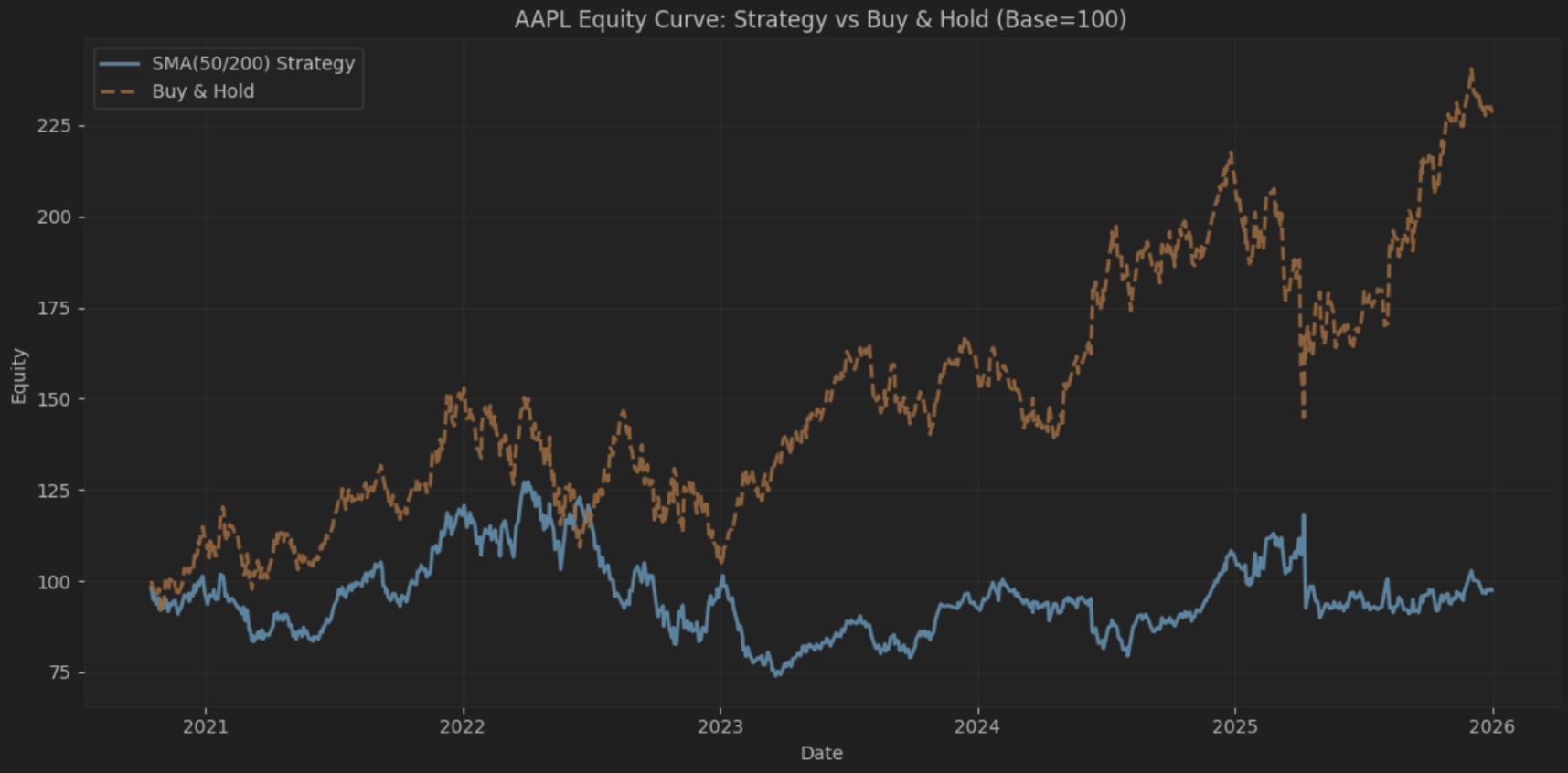
As you can see, our strategy resulted in a small loss, whereas the Buy-and-Hold strategy doubled our initial principal in 5 years. It would have been nice to see some profits from such a simple approach, but investing is often more challenging than it appears, and performance (even backtested) is never guaranteed. This is also a simplified backtest. It ignores transaction costs, slippage, and real-world shorting constraints.
If you want to test your own strategy, you will just have to calculate your technical indicators and develop the conditions that will define the “signal” column. For the rest of the code, it should be the same. Also, you can read the article How to Get Historical Market Data and Why It Matters for Model Validation, which provides a more detailed idea of why backtesting is important and how to validate your model.
Is Daily the Only Solution?
Sometimes, when we want to analyse long periods, we don't want the noise of daily prices and find it easier to see the weekly or monthly data. For that reason, there's no need to use another endpoint that provides this data. Let's see why.
In the example below, we get the daily OHLC values of Apple for the last 15 years:
|
symbol = 'AAPL' from_date = '2015-01-01' to_date = '2025-12-31' url = f'https://financialmodelingprep.com/stable/historical-price-eod/full' querystring = {"apikey":token, "symbol":symbol, "from":from_date, "to":to_date} resp = requests.get(url, querystring).json() df = pd.DataFrame(resp) df['date'] = pd.to_datetime(df['date']) df.sort_values('date', inplace=True) df.set_index('date', inplace=True) df |
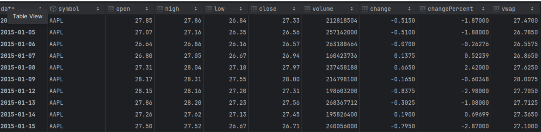
This way, we will have around 2,700 lines of daily data, which can be overwhelming. Sometimes it's better to convert the data to weekly or monthly to reduce the noise. This can be done quite easily with the pandas library using the resample function.
|
df = df.resample('ME').agg({ 'symbol': 'last', 'open': 'first', 'high': 'max', 'low': 'min', 'close': 'last', 'volume': 'sum', 'vwap': 'mean' }) df |
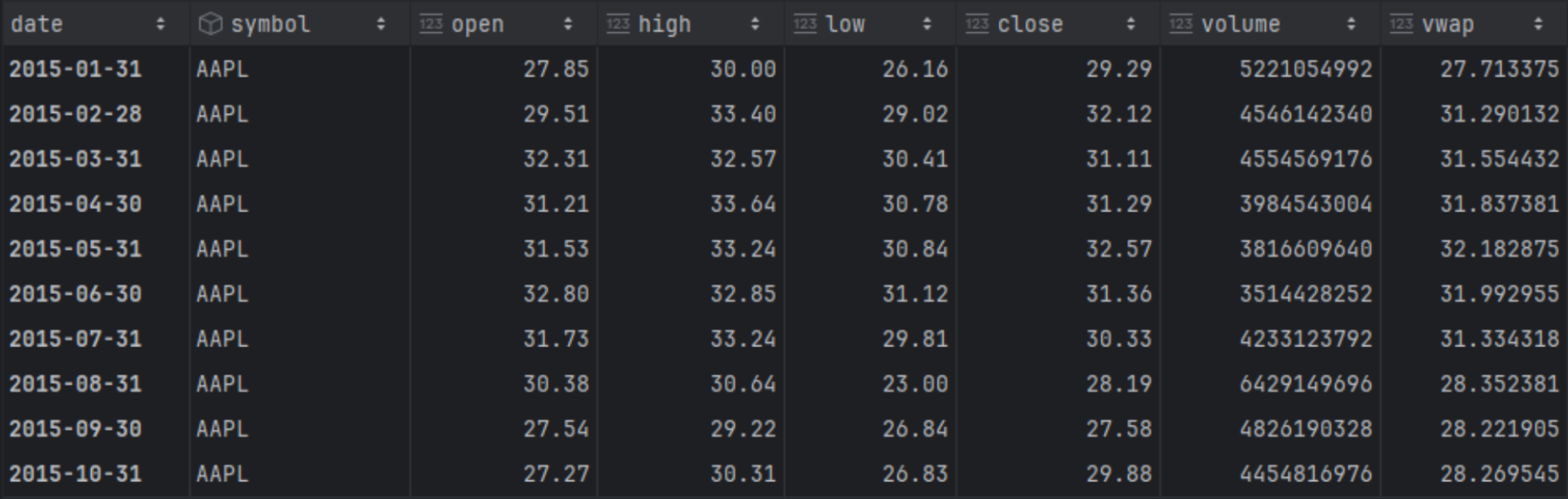
Now we have around 130 rows with aggregated and more manageable data. Besides reducing noise, this is also very useful when backtesting strategies across different timeframes. In that case, you don't need to keep the various timeframes in separate dataframes. You only need one dataframe (the more detailed one), which you resample according to your needs.
Final Thoughts
FMP's endpoints, as described in the article, truly form a strong foundation for traders. They offer reliable, customisable historical data that support everything from basic price charts to more sophisticated backtesting and technical analysis. In daily trading routines, quants favour the lightweight endpoints for quick momentum checks, while full OHLCV data aids in identifying trend crossovers like SMA. Dividend-adjusted series provide a more accurate view of total returns, whilst unadjusted data gives raw performance insights, making Python workflows with pandas much easier.
There are many ways to utilise this data. To help you scale your analysis, we have put together five guides for building a market data foundation. Whether you're normalising comparisons across various stocks, resampling data to weekly intervals, or analysing price ratios, these APIs seamlessly integrate into your data workflows. They enable you to make more informed, noise-free decisions.