


Company Information APIs in Practice: Building Dashboards, Peer Views, and Survivorship-Safe Backtests with FMP
Price and fundamentals matter, but they are not the full picture. If you are building a screener, a dashboard, or a backtest, you also need basic company context. Who the company is, what sector it sits in, who its closest peers are, how its market cap evolved over time, whether it has been involved in recent M&A, and whether your dataset is quietly excluding companies that no longer exist. A common example is a backtest that looks great on paper simply because it only includes today's surviving tickers, while the names that got delisted never even make it into the universe.
In this guide, we will use five endpoints from FMP's Company Information suite to build practical workflows. We will start with a simple company and peer dashboard, then build an M&A dashboard by sector, run peer-based market cap correlation analysis, and finish with a survivorship bias fix using delisted company data.
Endpoints overview
These five endpoints work best as a small system. Profile gives you the base context for a ticker. Peers gives you a comparable set to evaluate it against. Historical market cap lets you study how “size” changes over time, which is often more useful than price alone for long-horizon analysis. M&A gives you corporate events you can aggregate into dashboards. Delisted companies is the guardrail that helps you build research datasets that do not silently ignore failed names.
Below, we will do a basic pull for each endpoint and look at the key fields you will actually use later in the guide.
1. Company Profile Data API
This is the base endpoint. It gives you identity, classification, and market snapshot fields in one response.
|
import requests import pandas as pd token = "YOUR_FMP_TOKEN" symbol = "AAPL" url = "https://financialmodelingprep.com/stable/profile" params = {"apikey": token, "symbol": symbol} data = requests.get(url, params=params).json() profile = data[0] profile |
Note: Replace "YOUR_FMP_TOKEN" with your secret FMP API key. If you don't have one, you can obtain it by opening an FMP developer account.
Output:
|
{'symbol': 'AAPL', 'price': 264.18, 'marketCap': 3882897839444.9995, 'beta': 1.107, 'lastDividend': 1.04, 'range': '169.21-288.62', 'change': -8.77, 'changePercentage': -3.21304, 'volume': 71592273, 'averageVolume': 48279330, 'companyName': 'Apple Inc.', 'currency': 'USD', 'cik': '0000320193', 'isin': 'US0378331005', 'cusip': '037833100', 'exchangeFullName': 'NASDAQ Global Select', 'exchange': 'NASDAQ', 'industry': 'Consumer Electronics', 'website': 'https://www.apple.com', 'description': 'Apple Inc. designs, manufactures, and markets smartphones, personal computers, tablets, wearables, and accessories worldwide. The company offers iPhone, a line of smartphones; Mac, a line of personal computers; iPad, a line of multi-purpose tablets; and wearables, home, and accessories comprising AirPods, Apple TV, Apple Watch, Beats products, and HomePod. It also provides AppleCare support and cloud services; and operates various platforms, including the App Store that allow customers to discover and download applications and digital content, such as books, music, video, games, and podcasts, as well as advertising services include third-party licensing arrangements and its own advertising platforms. In addition, the company offers various subscription-based services, such as Apple Arcade, a game subscription service; Apple Fitness+, a personalized fitness service; Apple Music, which offers users a curated listening experience with on-demand radio stations; Apple News+, a subscription news and magazine service; Apple TV+, which offers exclusive original content; Apple Card, a co-branded credit card; and Apple Pay, a cashless payment service, as well as licenses its intellectual property. The company serves consumers, and small and mid-sized businesses; and the education, enterprise, and government markets. It distributes third-party applications for its products through the App Store. The company also sells its products through its retail and online stores, and direct sales force; and third-party cellular network carriers, wholesalers, retailers, and resellers. Apple Inc. was founded in 1976 and is headquartered in Cupertino, California.', 'ceo': 'Timothy D. Cook', 'sector': 'Technology', 'country': 'US', 'fullTimeEmployees': '164000', 'phone': '(408) 996-1010', 'address': 'One Apple Park Way', 'city': 'Cupertino', 'state': 'CA', 'zip': '95014', 'image': ' 'ipoDate': '1980-12-12', 'defaultImage': False, 'isEtf': False, 'isActivelyTrading': True, 'isAdr': False, 'isFund': False} |

In practice, these are the fields that matter most:
- companyName, description, website, ceo, fullTimeEmployees, ipoDate give basic company context for dashboards and reporting.
- sector, industry, exchange, exchangeFullName, country, currency are the classification fields. They are important for grouping, filtering, and aggregation later.
- price, marketCap, beta, range, change, changePercentage, averageVolume are snapshot market fields. They are useful for quick comparisons, but not substitutes for time series analysis.
- cik, isin, cusip help when you need to cross-reference external identifiers, especially for SEC-linked workflows.
- Flags like isEtf, isFund, isAdr, isActivelyTrading help you keep your universe clean when you are running automation across many symbols.
2. Stock Peer Comparison API
This endpoint gives you a lightweight peer list for a symbol. The output is intentionally minimal. You get peers plus a few quick market fields.
|
url = "https://financialmodelingprep.com/stable/stock-peers" params = {"apikey": token, "symbol": symbol} peers = requests.get(url, params=params).json() peers[:5] |
Output:
|
[{'symbol': 'GOOGL', 'companyName': 'Alphabet Inc.', 'price': 311.76, 'mktCap': 3771360870268}, {'symbol': 'META', 'companyName': 'Meta Platforms, Inc.', 'price': 648.18, 'mktCap': 1634057222646}, {'symbol': 'MSFT', 'companyName': 'Microsoft Corporation', 'price': 392.74, 'mktCap': 2916341926200}, {'symbol': 'NVDA', 'companyName': 'NVIDIA Corporation', 'price': 177.19, 'mktCap': 4306603081652}, {'symbol': 'NXT', 'companyName': 'Nextpower Inc.', 'price': 105.1, 'mktCap': 15604811099}] |
Each peer item includes:
- symbol and companyName so you can build a peer set.
- price and mktCap as lightweight context, mainly to sanity check scale.
The main value is the peer list itself. Once you have the peer symbols, you can enrich them with profile data or time series metrics, which is what we will do later for correlations and dashboards.
3. Historical Market Cap API
Market cap is often treated as a single number. This endpoint lets you treat it as a time series. That matters for comparing growth paths across peers and for avoiding misleading price-only narratives.
|
url = "https://financialmodelingprep.com/stable/historical-market-capitalization" params = {"apikey": token, "symbol": symbol, "limit": 20} mcap = requests.get(url, params=params).json() df_mcap = pd.DataFrame(mcap) df_mcap.head() |
Output:
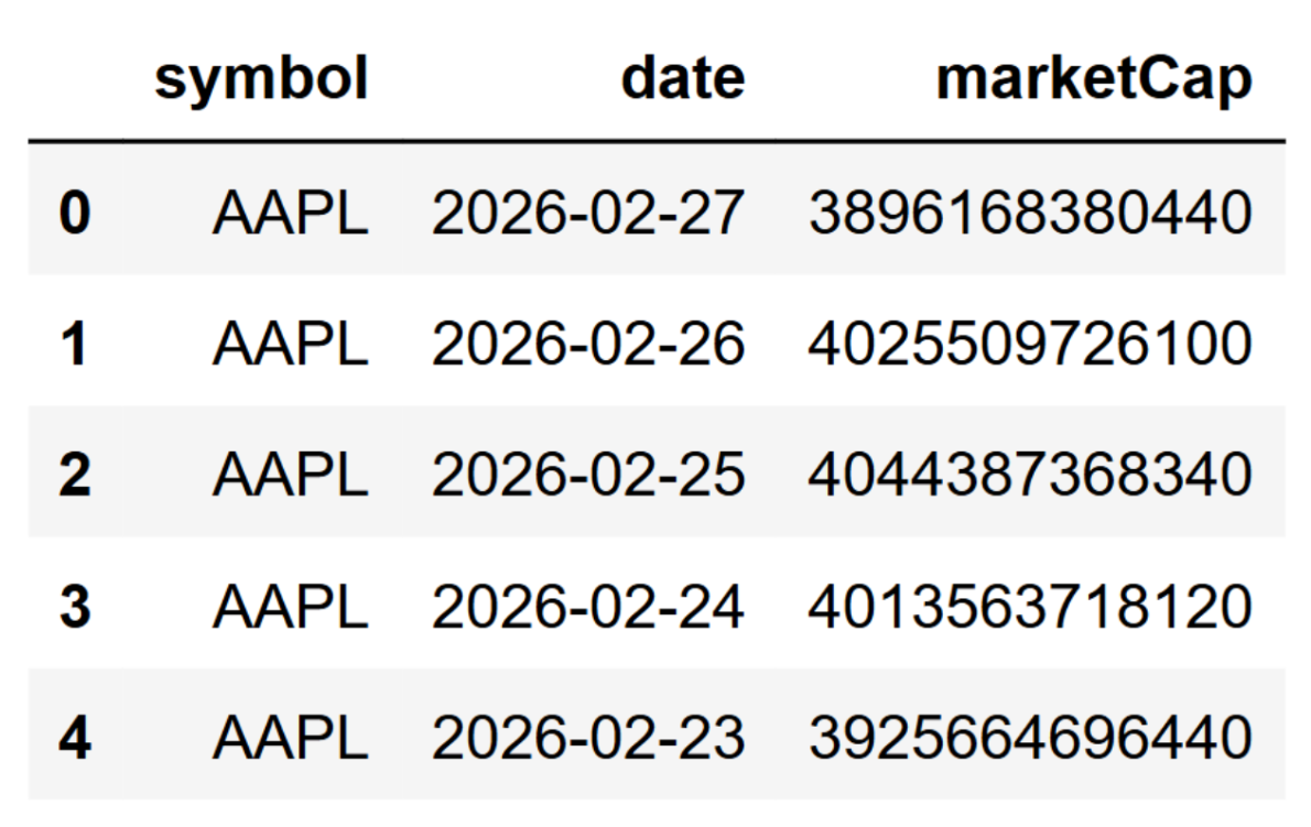
Key fields are simple:
- date is the observation date.
- marketCap is market value on that date.
- symbol is included for convenience when you concatenate multiple tickers.
We will use this later to build peer correlation heatmaps and to combine market cap trends with technical indicators.
4. Latest Mergers and Acquisitions API
This endpoint returns recent M&A events with enough metadata to build dashboards and drill into the SEC filing if needed.
|
url = "https://financialmodelingprep.com/stable/mergers-acquisitions-latest" params = {"apikey": token, "page": 0, "limit": 10} ma = requests.get(url, params=params).json() ma[0] |
Output:
|
{'symbol': 'BSX', 'companyName': 'BOSTON SCIENTIFIC CORP', 'cik': '0000885725', 'targetedCompanyName': 'Penumbra, Inc.', 'targetedCik': '0001321732', 'targetedSymbol': 'PEN', 'transactionDate': '2026-02-27', 'acceptedDate': '2026-02-27 16:35:50', 'link': 'https://www.sec.gov/Archives/edgar/data/885725/000110465926021633/tm266847-1_s4.htm'} |
The fields you will use most:
- Acquirer info: symbol, companyName, cik
- Target info: targetedSymbol, targetedCompanyName, targetedCik
- Event timing: transactionDate, acceptedDate
- link points to the SEC filing, which is useful for verification and deeper research.
Notice that this payload does not include sector. If you want a sector-level M&A dashboard, you will usually enrich the acquiring company using the profile endpoint and use its sector as the grouping field.
5. Delisted Companies API
This endpoint returns a list of companies that have been delisted, with key dates. It is mainly used for dataset hygiene, not dashboards.
|
url = "https://financialmodelingprep.com/stable/delisted-companies" params = {"apikey": token, "page": 0, "limit": 10} delisted = requests.get(url, params=params).json() delisted[:3] |
Output:
|
[{'symbol': '5CV.DE', 'companyName': 'CureVac N.V.', 'exchange': 'XETRA', 'ipoDate': '2020-08-25', 'delistedDate': '2026-12-05'}, {'symbol': 'E8X.DE', 'companyName': 'elexxion AG', 'exchange': 'XETRA', 'ipoDate': '2006-10-31', 'delistedDate': '2026-12-02'}, {'symbol': 'AHL', 'companyName': 'ASPEN INSURANCE HOLDINGS LTD', 'exchange': 'NYSE', 'ipoDate': '2025-05-08', 'delistedDate': '2026-02-24'}] |
Key fields:
- symbol and companyName identify the delisted name.
- exchange gives the venue it was last listed on.
- ipoDate and delistedDate are the timeline anchors.
This is the endpoint that helps you avoid survivorship bias. If your backtest universe only contains currently active tickers, you are ignoring the companies that disappeared, which can inflate results. We will use this later to show how to build a survivorship-aware universe.
Use Case 1: Dashboards
In this section we will build two small dashboards. The first is a company snapshot that combines profile data with a peer view. The second is a sector-level M&A dashboard built from the latest deals, enriched with sector data from the profile endpoint.
i. Company Dashboard. Profile Plus Peers
A good company dashboard answers basic questions fast. What does the company do. Which sector is it in. How large is it. How liquid is it. Who are its closest public peers. You can build that with two calls, then merge the results into a clean view.
Start by pulling the company profile.
|
import requests import pandas as pd token = "YOUR FMP API KEY" symbol = "AAPL" url_profile = "https://financialmodelingprep.com/stable/profile" params_profile = {"apikey": token, "symbol": symbol} profile = requests.get(url_profile, params=params_profile).json()[0] profile_view = { "symbol": profile.get("symbol"), "companyName": profile.get("companyName"), "sector": profile.get("sector"), "industry": profile.get("industry"), "exchange": profile.get("exchange"), "country": profile.get("country"), "currency": profile.get("currency"), "price": profile.get("price"), "marketCap": profile.get("marketCap"), "beta": profile.get("beta"), "averageVolume": profile.get("averageVolume"), "ipoDate": profile.get("ipoDate"), "website": profile.get("website"), } df_profile = pd.DataFrame([profile_view]) df_profile |
Now pull peers for the same symbol.
|
url_peers = "https://financialmodelingprep.com/stable/stock-peers" params_peers = {"apikey": token, "symbol": symbol} peers = requests.get(url_peers, params=params_peers).json() df_peers = pd.DataFrame(peers) df_peers.head() |
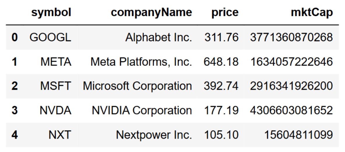
At this point you have a peer list, but it is still shallow. A simple upgrade is to enrich peers with the profile endpoint so you can compare sector, industry, and market cap consistently. Keep it tight. Only pull the fields you need.
|
def get_profile(symbol: str) -> dict: resp = requests.get(url_profile, params={"apikey": token, "symbol": symbol}).json() return resp[0] if resp else {} peer_symbols = df_peers["symbol"].dropna().unique().tolist() peer_profiles = [] for s in peer_symbols: p = get_profile(s) if p: peer_profiles.append({ "symbol": p.get("symbol"), "companyName": p.get("companyName"), "sector": p.get("sector"), "industry": p.get("industry"), "price": p.get("price"), "marketCap": p.get("marketCap"), "beta": p.get("beta"), "averageVolume": p.get("averageVolume"), }) df_peer_profiles = pd.DataFrame(peer_profiles) df_peer_profiles = df_peer_profiles.sort_values("marketCap", ascending=False) df_peer_profiles |
If you're doing this at scale, avoid calling the profile endpoint one ticker at a time. In production, you would cache results aggressively or batch requests wherever possible to stay within rate limits and keep the pipeline fast.
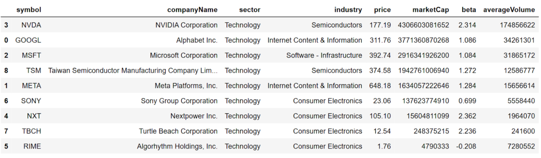
Now you can present a clean “dashboard” layout. One block for the company summary, and another block for the peer table.
|
print("Company snapshot") display(df_profile) print("\nPeers (enriched)") display(df_peer_profiles.head(10)) |
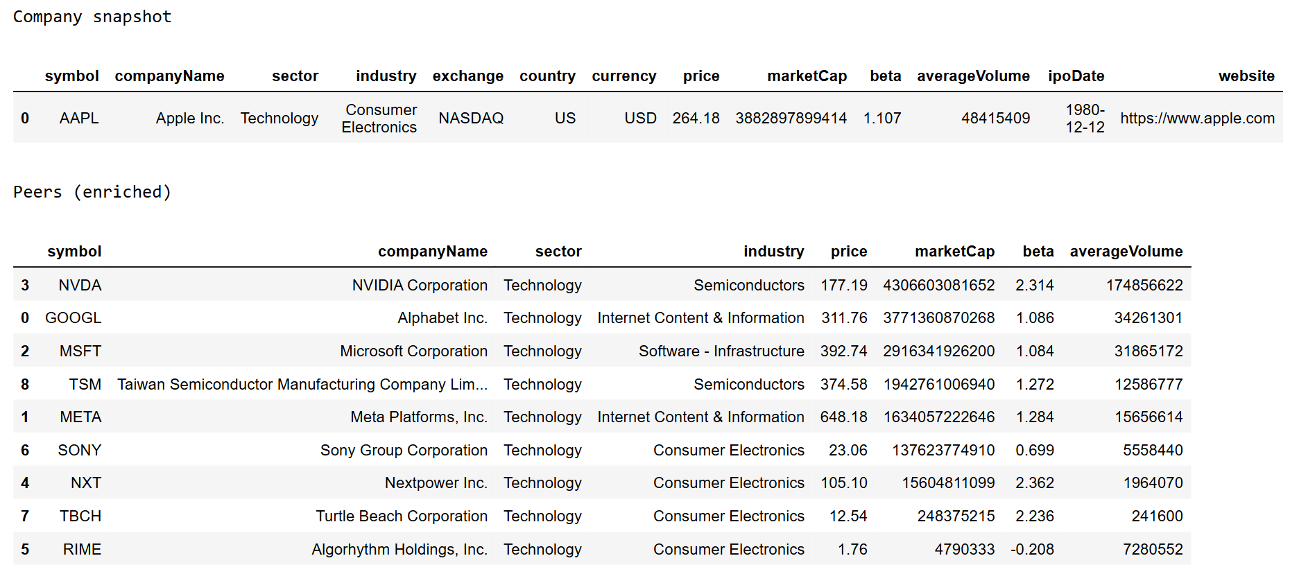
If you want to make this more product-like, add two small computed fields that investors actually use when scanning peers.
|
df_peer_profiles["marketCap_B"] = df_peer_profiles["marketCap"] / 1e9 df_peer_profiles["avgVol_M"] = df_peer_profiles["averageVolume"] / 1e6 df_peer_profiles[["symbol", "companyName", "sector", "industry", "marketCap_B", "beta", "avgVol_M"]].head(10) |
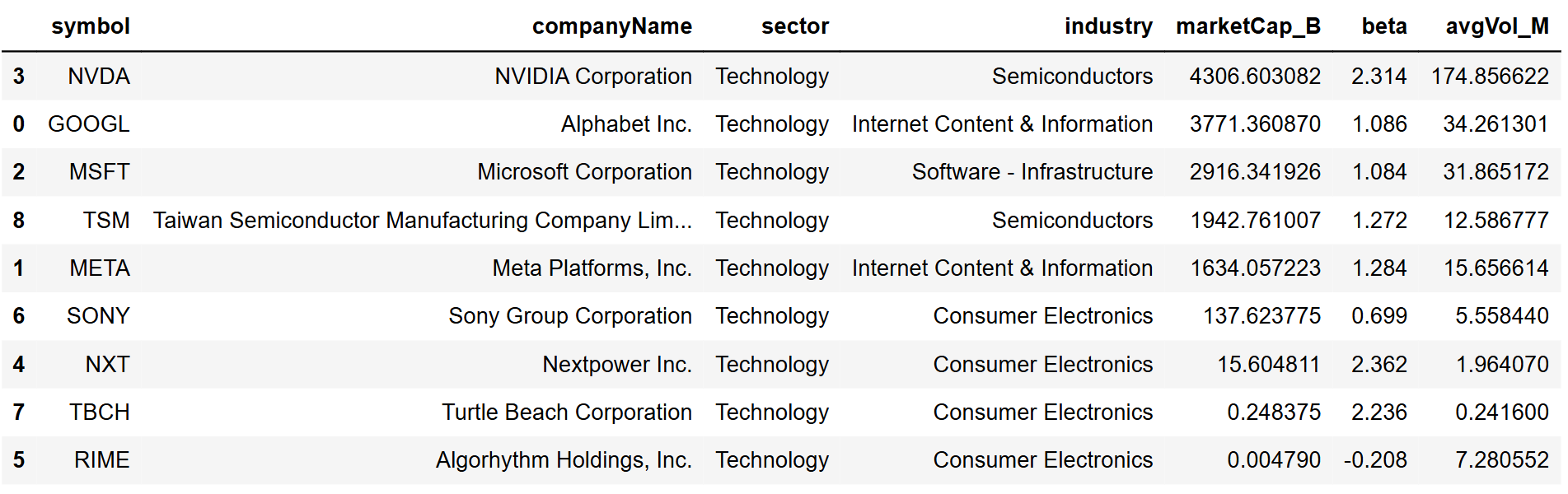
This is already enough for a practical company dashboard. You can drop it into Streamlit later, but even as a dataframe view, it answers most “context” questions.
ii. Mergers and Acquisitions Dashboard by Sector
The M&A endpoint returns deals with symbols, names, and links. It does not include sector. So the trick is to enrich the acquirer with profile data, then group deals by sector.
Pull the latest deals first.
|
url_ma = "https://financialmodelingprep.com/stable/mergers-acquisitions-latest" params_ma = {"apikey": token, "page": 0, "limit": 200} deals = requests.get(url_ma, params=params_ma).json() df_ma = pd.DataFrame(deals) df_ma.head() |
Clean the core fields we care about.
|
df_ma["transactionDate"] = pd.to_datetime(df_ma["transactionDate"], errors="coerce") df_ma_view = df_ma[["transactionDate","symbol","companyName","targetedSymbol","targetedCompanyName","link"]].dropna(subset=["transactionDate"]) df_ma_view.head() |

Now enrich with sector using the acquirer symbol. To keep calls under control, cache profiles so you only fetch each symbol once.
|
profile_cache = {} def get_sector(symbol: str): if symbol in profile_cache: return profile_cache[symbol] p = get_profile(symbol) sector = p.get("sector") if p else None profile_cache[symbol] = sector return sector df_ma_view["sector"] = df_ma_view["symbol"].apply(get_sector) df_ma_view = df_ma_view.dropna(subset=["sector"]) df_ma_view.head() |
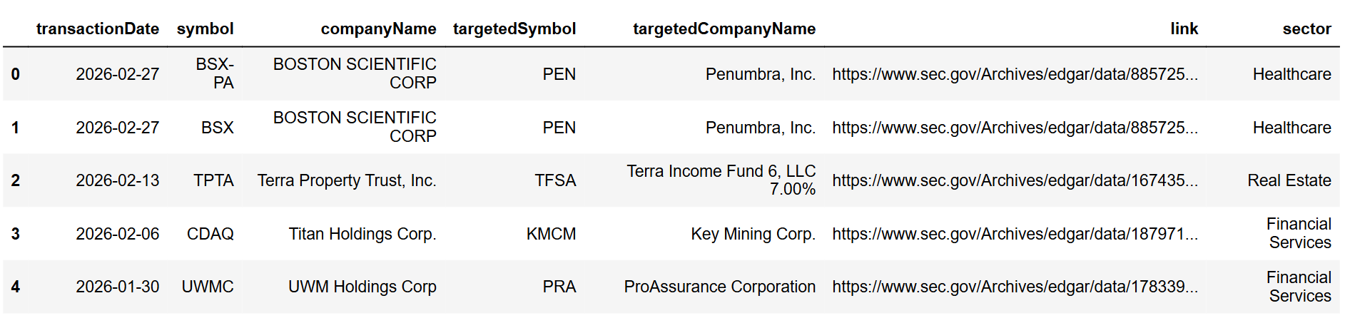
Now build the dashboard views. The two most useful are:
- a sector summary table, and
- a recent deals table you can filter by sector.
|
sector_summary = ( df_ma_view.groupby("sector") .agg( deals=("symbol", "count"), latest_deal=("transactionDate", "max") ) .sort_values("deals", ascending=False) .reset_index() ) sector_summary |
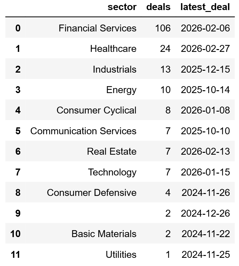
And a simple “latest deals” table.
|
latest_deals = df_ma_view.sort_values("transactionDate", ascending=False).head(25) latest_deals |
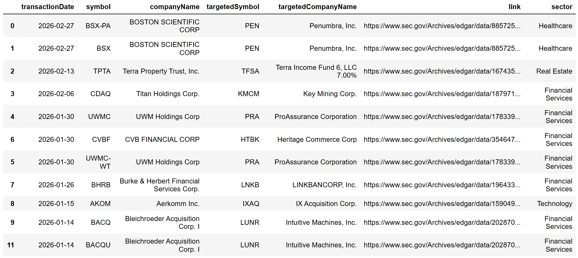
If you want one extra layer of clarity, add a simple chart of deal counts by sector.
|
import matplotlib.pyplot as plt top_sectors = sector_summary.head(10).copy() plt.figure(figsize=(10, 5)) plt.bar(top_sectors["sector"], top_sectors["deals"]) plt.xticks(rotation=45, ha="right") plt.title("Latest M&A deals by sector") plt.ylabel("Deal count") plt.tight_layout() plt.show() |
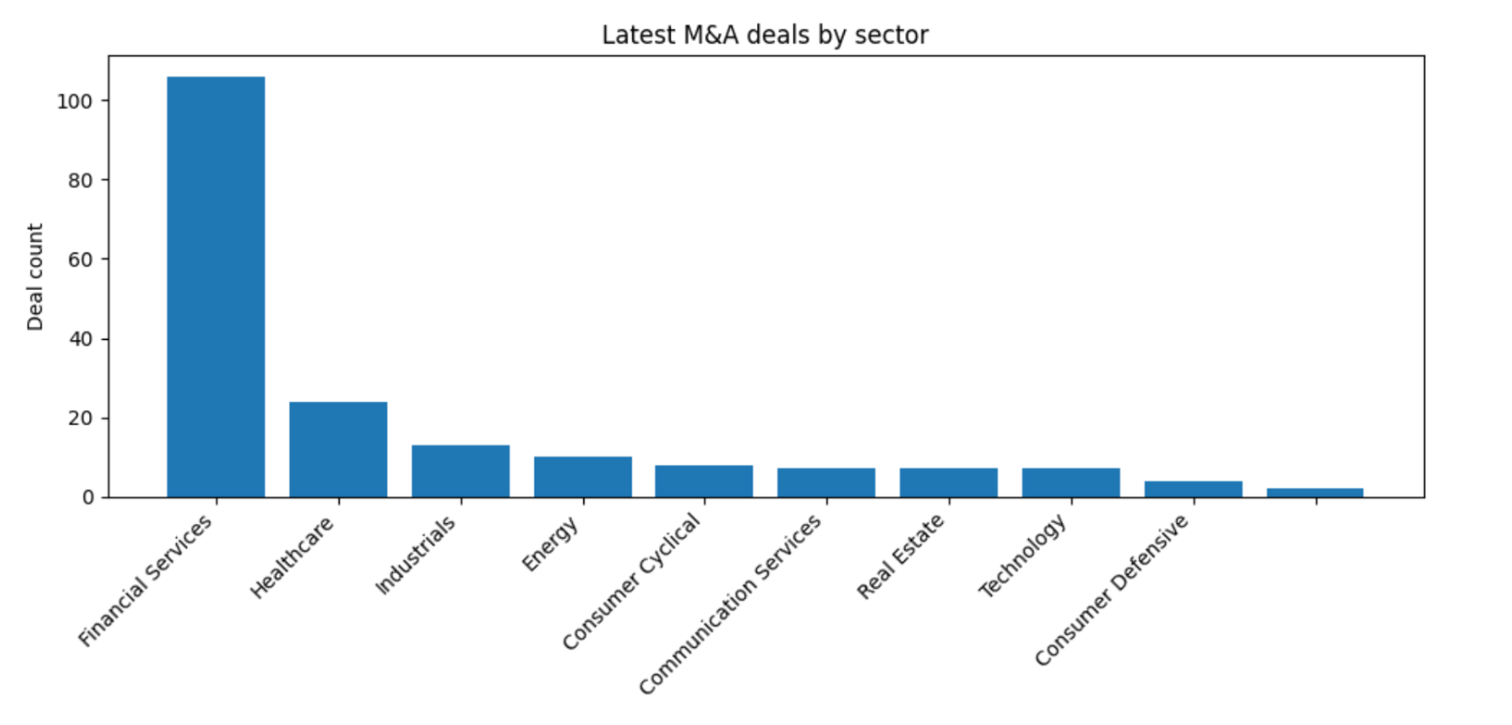
That's the core workflow. M&A gives the events, profile gives sector context, and grouping turns it into a dashboard. Once you have this structure, you can also slice by time window, track the most active acquirers, or build alerts when certain sectors heat up.
Use Case 2: Peer Correlations and Market Cap Plus Technical Context
In this section, we'll do two things.
First, we'll take one company, pull its peer list, fetch historical market cap for the company and its peers, and build a correlation heatmap. This is useful when you want to see whether peers are actually moving in “size” together, or if one name is evolving differently.
Second, we'll take a single company and combine its market cap time series with a simple technical indicator, so you can see how price trend and size trend behave together.
i. Market Cap Correlation Heatmap Using Peers
Start by picking a base ticker.
|
import requests import pandas as pd import numpy as np import matplotlib.pyplot as plt token = "YOUR FMP API KEY" symbol = "AAPL" url_peers = "https://financialmodelingprep.com/stable/stock-peers" peers = requests.get(url_peers, params={"apikey": token, "symbol": symbol}).json() df_peers = pd.DataFrame(peers) peer_symbols = df_peers["symbol"].dropna().unique().tolist() symbols = [symbol] + peer_symbols symbols[:10], len(symbols) |
Now pull historical market cap for each symbol. Keep the window fixed so the correlation is meaningful. Also keep the limit reasonable so you do not pull years of data for the first pass.
|
url_mcap = "https://financialmodelingprep.com/stable/historical-market-capitalization" def fetch_mcap_series(sym, limit=365): data = requests.get(url_mcap, params={"apikey": token, "symbol": sym, "limit": limit}).json() if not data: return None df = pd.DataFrame(data) df["date"] = pd.to_datetime(df["date"], errors="coerce") df = df.dropna(subset=["date"]).sort_values("date") df = df.set_index("date")[["marketCap"]].rename(columns={"marketCap": sym}) return df mcap_frames = [] for s in symbols: df_s = fetch_mcap_series(s, limit=500) if df_s is not None: mcap_frames.append(df_s) df_mcap = pd.concat(mcap_frames, axis=1).sort_index() |
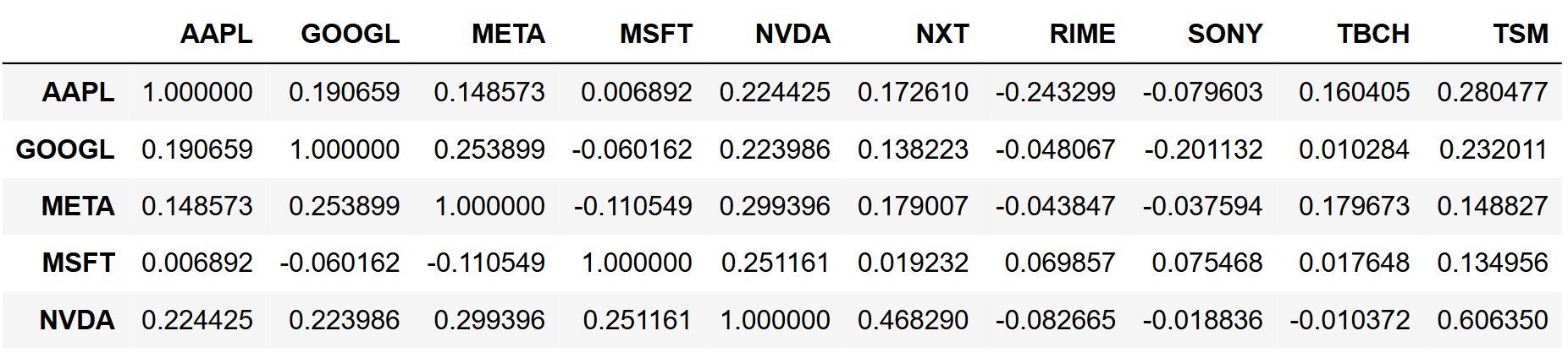
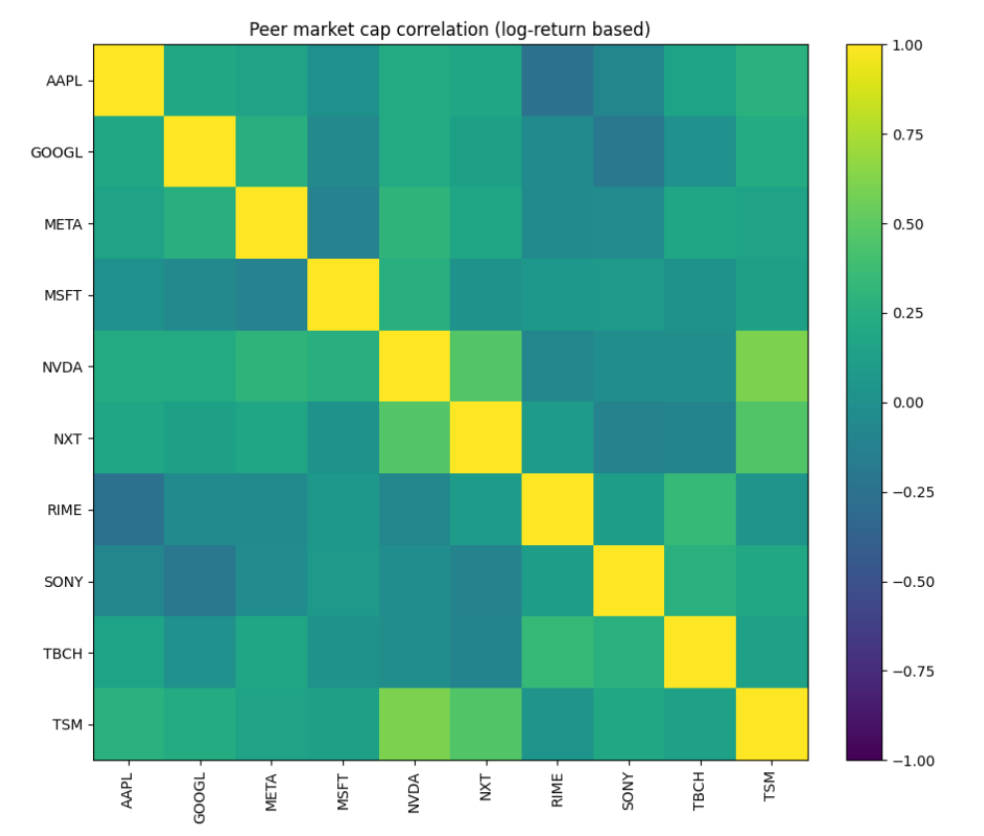
Now compute correlation and plot a heatmap. Market cap levels can be very large and skewed, so it is often cleaner to correlate market cap changes rather than raw levels. We'll use log returns of market cap for that.
|
# note: in production, guard against missing or zero market cap values before taking logs. mcap_log_ret = np.log(df_mcap).diff().dropna() corr = mcap_log_ret.corr() corr.head() |
Heatmap plot:
|
fig, ax = plt.subplots(figsize=(10, 8)) im = ax.imshow(corr.values, vmin=-1, vmax=1) ax.set_xticks(range(len(corr.columns))) ax.set_yticks(range(len(corr.index))) ax.set_xticklabels(corr.columns, rotation=90) ax.set_yticklabels(corr.index) plt.colorbar(im, ax=ax, fraction=0.046, pad=0.04) ax.set_title("Peer market cap correlation (log-return based)") plt.tight_layout() plt.show() |
Interpretation:
A couple of pairs stand out as the tightest relationships in this window. NVDA and TSM show the strongest positive correlation in the set, with NXT also clustering close to them, which suggests that their market caps tended to expand and contract in the same direction over the period. In other words, within this peer group, that “semis cluster” is behaving like a real peer cluster in market value terms, not just a label.
On the other side, you can see weaker links and a few negative patches. AAPL vs RIME is one of the clearer negative relationships here, and a few other pairs sit near zero, meaning their market cap moves were mostly independent over this window. That's usually what you see when the peer list includes companies that look similar at a surface level but are being repriced for different reasons. This heatmap is basically telling you which peers are moving as a group and which ones are idiosyncratic.
ii. Combine Technical Trend with Market Cap Trend
Now let's take a single symbol and overlay a simple trend indicator with market cap evolution.
We already have historical market cap. We now need a close price series. For this guide, we'll compute a basic EMA on closing prices and plot it with market cap.
|
url_prices = "https://financialmodelingprep.com/stable/historical-price-eod/light" def fetch_close_series(sym, limit=500): data = requests.get(url_prices, params={"apikey": token, "symbol": sym, "limit": limit}).json() df = pd.DataFrame(data) df["date"] = pd.to_datetime(df["date"], errors="coerce") df = df.dropna(subset=["date"]).sort_values("date") df = df.set_index("date")[["price"]].rename(columns={"price": "close"}) return df df_price = fetch_close_series(symbol, limit=800) df_price.head() |
Join price and market cap on a shared timeline.
|
df_single_mcap = df_mcap[[symbol]].rename(columns={symbol: "marketCap"}) df_combo = df_single_mcap.join(df_price, how="inner").dropna() df_combo["ema50"] = df_combo["close"].ewm(span=50, adjust=False).mean() df_combo.head() |
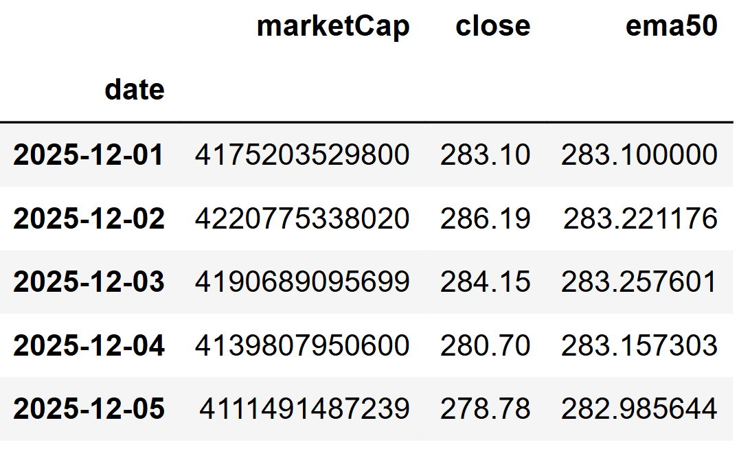
Now plot. Price with EMA on the left, market cap on the right.
|
fig, ax1 = plt.subplots(figsize=(12, 6)) ax1.plot(df_combo.index, df_combo["close"], label="Close", linewidth=1.5) ax1.plot(df_combo.index, df_combo["ema50"], label="EMA 50", linewidth=2) ax1.set_xlabel("Date") ax1.set_ylabel("Price") ax1.grid(True, alpha=0.3) ax1.legend(loc="upper left") ax2 = ax1.twinx() ax2.plot(df_combo.index, df_combo["marketCap"], label="Market Cap", linewidth=2, linestyle="--") ax2.set_ylabel("Market Cap") plt.title(f"{symbol}: Price trend vs market cap trend") plt.tight_layout() plt.show() |
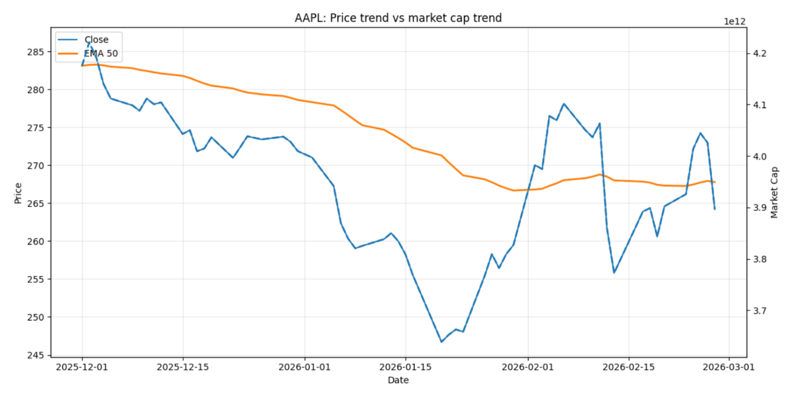
Interpretation:
In this slice, AAPL's price trend and market cap trend mostly point in the same direction, but the timing is different. The price sells off through December into mid-January, and the EMA50 slopes down steadily, which is exactly what you'd expect in a sustained downtrend. The rebound into early February shows up first in the price, while the EMA lags and only starts flattening and turning up after the move is already underway.
The market cap line tells a slightly calmer story. It drifts down from the December highs, then flattens around late January and stays relatively steady even while price swings sharply in February. That divergence is useful. It suggests the price volatility in February is not translating into an equally dramatic shift in overall market value, at least in this window. When you see that, it's a hint that the move is more about short-term repricing and sentiment than a clean “size regime” shift.
Use case 3 - Using Delisted Companies to Reduce Survivorship Bias in Backtests
Survivorship bias is one of the most common backtesting mistakes. If your universe only includes today's active tickers, you are automatically excluding companies that got acquired, went bankrupt, or were delisted for other reasons. That can make a strategy look cleaner than it really was, especially for long lookback tests and small-cap style screens.
The delisted companies endpoint gives you a way to pull those missing names and treat them as part of the historical universe.
Pull a Delisted List and Define a Time Window
Start by pulling a few pages and building a dataframe. The endpoint is paginated with a max of 100 records per request, so you have to iterate.
|
import requests import pandas as pd token = "YOUR FMP API KEY" url_delisted = "https://financialmodelingprep.com/stable/delisted-companies" def fetch_delisted_pages(pages=5, limit=100): out = [] for page in range(pages): params = {"apikey": token, "page": page, "limit": limit} data = requests.get(url_delisted, params=params).json() if not data: break out.extend(data) return pd.DataFrame(out) df_delisted = fetch_delisted_pages(pages=10, limit=100) df_delisted["delistedDate"] = pd.to_datetime(df_delisted["delistedDate"], errors="coerce") df_delisted["ipoDate"] = pd.to_datetime(df_delisted["ipoDate"], errors="coerce") df_delisted.head() |
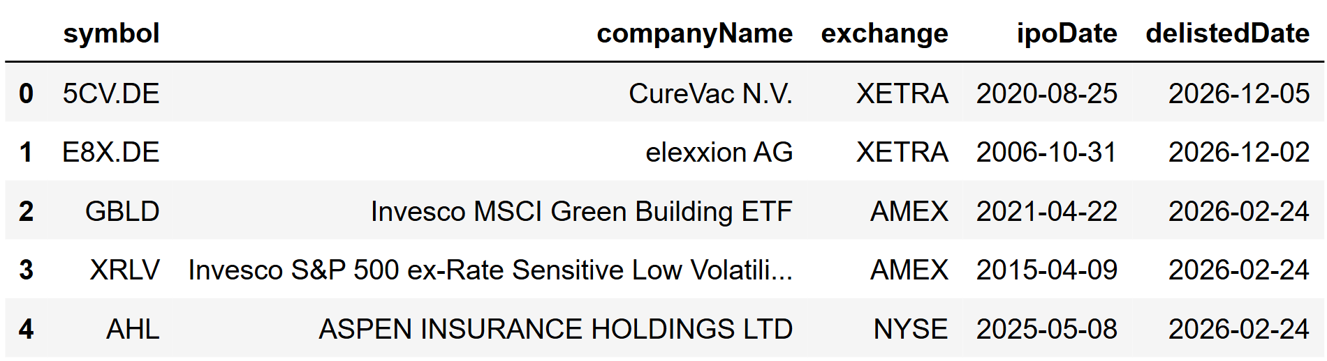
Now filter it to the delisting window you care about. For example, if you are backtesting from the start of 2025 to present date, delistings inside that window matter most.
|
start = "2025-01-01" end = "2026-02-28" df_window = df_delisted[ (df_delisted["delistedDate"] >= start) & (df_delisted["delistedDate"] <= end) ].copy() df_window = df_window.sort_values("delistedDate", ascending=False) df_window.head(20) |
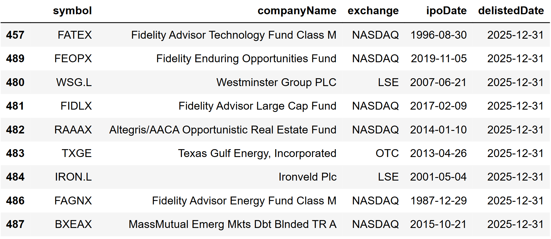
At this point, you have a list of tickers that disappeared during your test window. This is the list that a naive universe build would silently miss.
Use Delisted Tickers to Build a Survivorship-Aware Universe
A simple pattern is:
- Start with an active universe (your watchlist or screener output).
- Add delisted names from the same exchange or country.
- Then pull historical prices for the combined set.
Note: Make sure you filter delisted names using the same universe constraints as your active universe.
Here we will keep it minimal. We will just build a combined ticker list and show how you would use it.
|
active_universe = ["AAPL", "MSFT", "NVDA", "AMZN"] delisted_universe = df_window["symbol"].dropna().unique().tolist() combined_universe = list(set(active_universe + delisted_universe)) len(active_universe), len(delisted_universe), len(combined_universe) |
Output:
|
(4, 976, 980) |
This is the key shift. You are no longer pretending the market only contains survivors.
The Practical Impact on Backtesting
There are two places survivorship bias shows up fast.
First, it changes the distribution of returns. In many markets, delisted names tend to have worse outcomes on average, so excluding them can inflate backtest results.
Second, it changes hit rates for filters. If you are screening for low valuation, high leverage, or extreme drawdowns, some of the names that pass those filters are exactly the ones that later disappear. If they are missing from your dataset, the screen looks safer than it actually was.
You do not need to fully backtest in this guide to make the point. The workflow is what matters:
- use delisted companies to make the universe honest,
- then run the exact same strategy logic on the combined universe,
- compare results to see how much “free performance” came from ignoring failures.
If you want one quick visual check before running a full backtest, you can also plot delistings over time to see whether your test period includes heavy churn.
|
import matplotlib.pyplot as plt weekly = df_window.dropna(subset=["delistedDate"]).copy() weekly["week"] = weekly["delistedDate"].dt.to_period("W").astype(str) counts = weekly.groupby("week").size() plt.figure(figsize=(12, 4)) plt.plot(counts.index, counts.values, linewidth=2) plt.xticks(rotation=45, ha="right") plt.title("Delistings per week in the selected window") plt.ylabel("Count") plt.tight_layout() plt.show() |
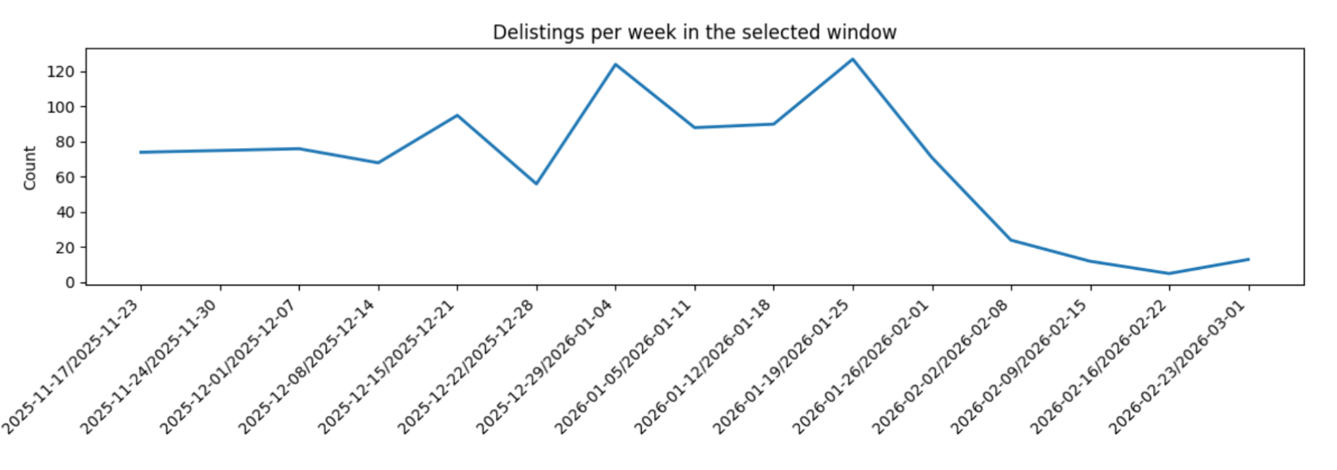
Once you build the habit of including delisted names, your backtests will usually look less perfect. That is a good thing. It means you are measuring something closer to reality.
Final thoughts
These five endpoints are sufficient for building a strong company context layer in many research workflows. Profile and peers help you turn a ticker into something you can compare and explain. Historical market cap adds a size lens that price alone does not capture. M&A gives you a clean way to monitor corporate activity and build sector dashboards. Delisted companies is the piece that keeps your backtests honest.
If you reuse anything from this guide, reuse the structure. Start with context, enrich with peers, add one time series lens like market cap, then make sure your universe is survivorship-aware before you trust any results.