FMP
How to Get Data to Build Market Charts and Dashboards
Nov 04, 2025
Ever found yourself with a trove of stock data but no clear way to turn it into an insightful chart? You're not alone. Many analysts and BI developers struggle to transform raw market data into compelling visuals for presentations. The good news: with the right data and approach, creating chart-ready market visuals is easier than you think.
In this article, we show analysts, BI developers, visualization specialists, and presentation teams how to retrieve market price data and convert it into effective charts and dashboards. We'll demonstrate how to use open, high, low, close (OHLC) and volume fields from Financial Modeling Prep (FMP) APIs to build candlestick, bar, and line charts.
You'll learn which FMP endpoints provide chart-friendly data, how aggregation intervals (daily vs. intraday) work, and which metrics (like moving averages) make your dashboards more meaningful.
By the end, you'll know how to turn API data into visual insights - from Excel spreadsheets to BI tools - and be ready to take the next step of setting up alerts for key market movements.
Understanding OHLC and Volume Data
Before diving into APIs, it's crucial to understand the key components of market charts: OHLC data and volume. These are the fundamental fields that make up most stock price visualizations:
- Open - the price when the trading period (day or minute) began.
- High - the highest price reached during that period.
- Low - the lowest price during that period.
- Close - the price at the end of the period (often the most referenced price).
- Volume - the number of shares traded during that period.
Each trading interval (whether a day, hour, or minute) can be summarized by these OHLC values and the volume traded. Charts like candlesticks and OHLC bar charts use all four price points to show the range and direction of price movement in the interval. Volume is typically shown as a separate bar chart, indicating how much trading activity occurred alongside the price changes. Together, OHLC and volume give a full picture of market activity: price movement and trading intensity.
For example, if a stock's price opened at $100, rose to $105, dipped to $98, and closed at $103 on a given day, with 5 million shares traded, those values (open=100, high=105, low=98, close=103, volume=5,000,000) would describe that day's trading. Visualized, this could appear as a single candlestick: a vertical line spanning $98 to $105 with a colored body between $100 and $103, and a volume bar showing 5M shares below. These data points are the building blocks for the charts we'll create.
Retrieving Chart-Ready Data from FMP APIs
To build market charts, we first need to retrieve the raw OHLC and volume data. Financial Modeling Prep offers several APIs that provide exactly this information in convenient JSON (or CSV) format. Let's look at the key endpoints you can use to get chartable data:
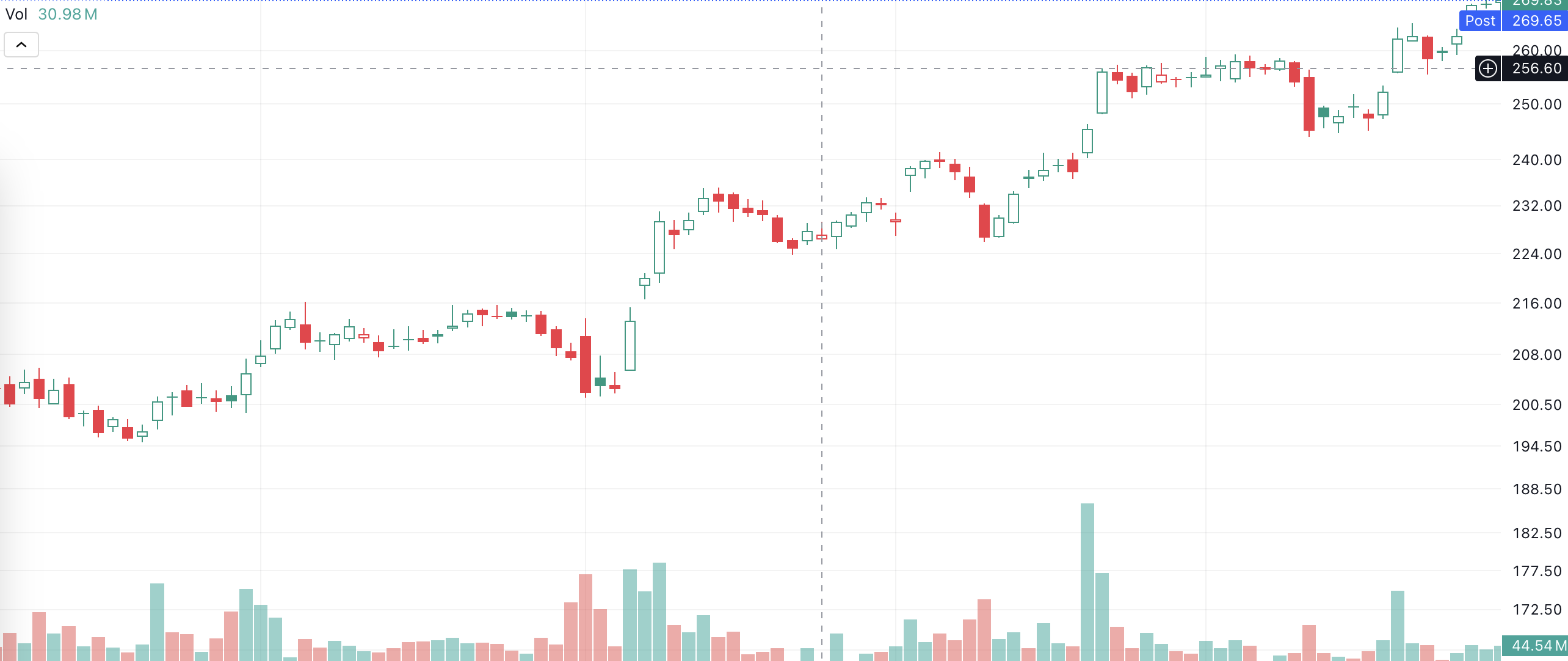
End-of-Day Stock Prices (OHLCV)
For daily historical prices and volume, the Stock Price and Volume Data API is your go-to. This endpoint returns end-of-day (EOD) data for each trading day, including OHLC and volume fields. For example, a request for Apple's full historical daily data would be:
|
GET https://financialmodelingprep.com/stable/historical-price-eod/full?symbol=AAPL&apikey=YOUR_API_KEY |
This returns a JSON array of daily records. Each record contains the date, open, high, low, close, and volume for that day, among other fields. For instance, a snippet of the JSON response looks like:
|
[ { "symbol": "AAPL", "date": "2025-10-29", "open": 269.275, "high": 271.41, "low": 267.11, "close": 268.79, "volume": 20699917, "change": -0.485, "changePercent": -0.1801, "vwap": 269.1 }, { "symbol": "AAPL", "date": "2025-10-28", "open": 268.99, "high": 269.89, "low": 268.15, "close": 269.00, "volume": 41461500, "change": 0.010, "changePercent": 0.0037, "vwap": 269.01 }, ... ] |
Each element in the array is a day's worth of data (often called a “bar” or “candle” in chart terms). With this daily OHLCV data, you can plot long-term charts like multi-month line trends or candlestick charts for each trading day. End-of-day data is considered official and is typically split-adjusted and vetted after market close, ensuring accuracy.
In fact, any discrepancies between intraday and end-of-day prices are resolved by close of business - the EOD figures become the source of truth for that day's open, high, low, and close.
End-of-Day Stock Prices Graph
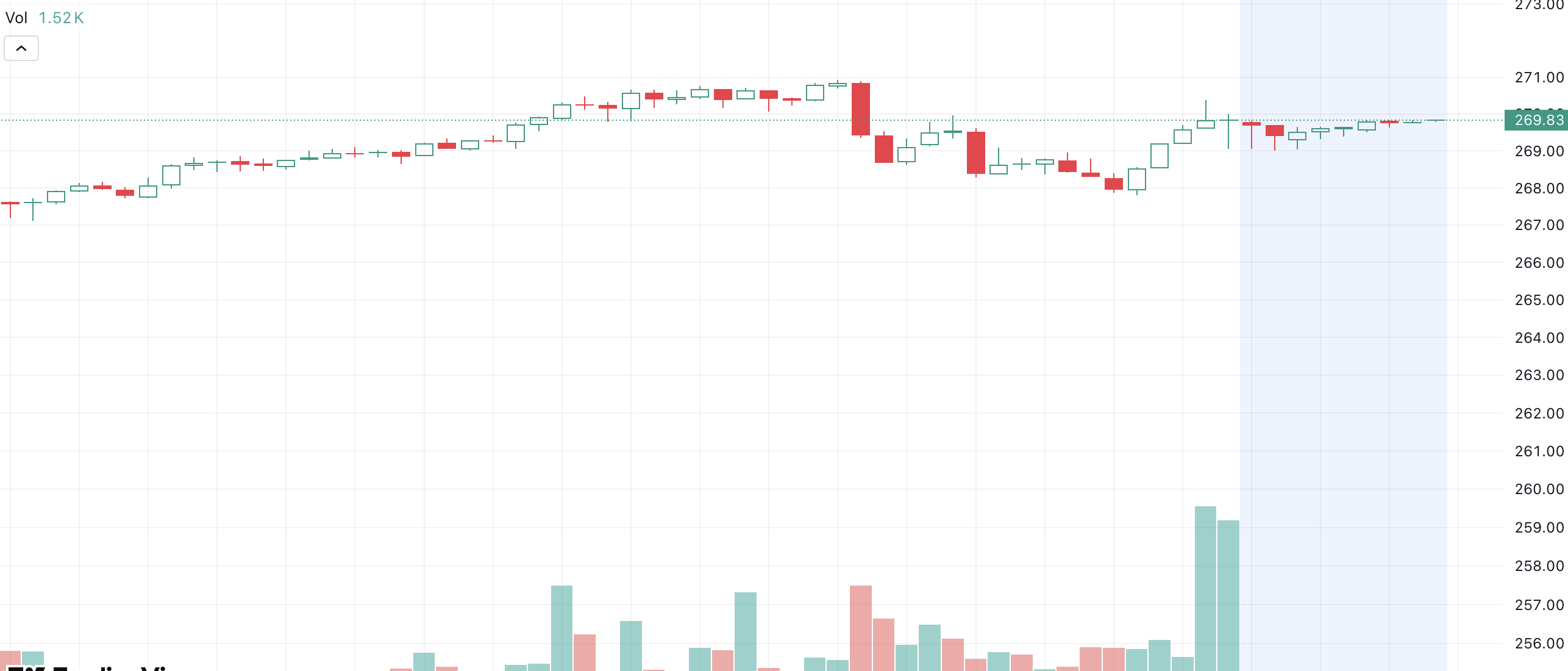
Intraday Interval Data (1-Min, 5-Min, etc.)
Sometimes you need more granularity for intraday charts or short-term dashboards. FMP's Historical Chart API provides intraday OHLC and volume data at various intervals (1-min, 5-min, 15-min, 30-min, 1-hour). For example, to get Apple's price data at a 1-minute interval, you would call:
|
GET https://financialmodelingprep.com/stable/historical-chart/1min?symbol=AAPL&apikey=YOUR_API_KEY |
The JSON response will list minute-by-minute records, each with a timestamp and OHLCV for that minute. For example:
|
[ { "date": "2025-10-29 12:25:00", "open": 268.645, "high": 268.715, "low": 268.630, "close": 268.6524, "volume": 31253 }, { "date": "2025-10-29 12:24:00", "open": 268.490, "high": 268.629, "low": 268.4705, "close": 268.6291, "volume": 25724 }, ... ] |
Each entry here represents one minute of trading. You can request other intervals (just replace 1min in the URL with 5min, 15min, etc., as supported). Intraday data is perfect for creating detailed charts of a single trading session or analyzing short-term patterns. For example, a 1-minute interval candlestick chart can show price fluctuations within a single day, useful for day traders or real-time dashboards.
Keep in mind that intraday APIs may return a lot of data. Often, you'll fetch intraday data for a specific date range or recent days to keep the dataset manageable. Also note that intraday values are preliminary - they come straight from live quotes. By day's end, the official OHLC might be slightly adjusted (as mentioned, the EOD data is the finalized record). Still, intraday endpoints are extremely useful for real-time monitoring and will let you plot tick-by-tick movements throughout the day.
Intraday Interval Stock Prices Graph
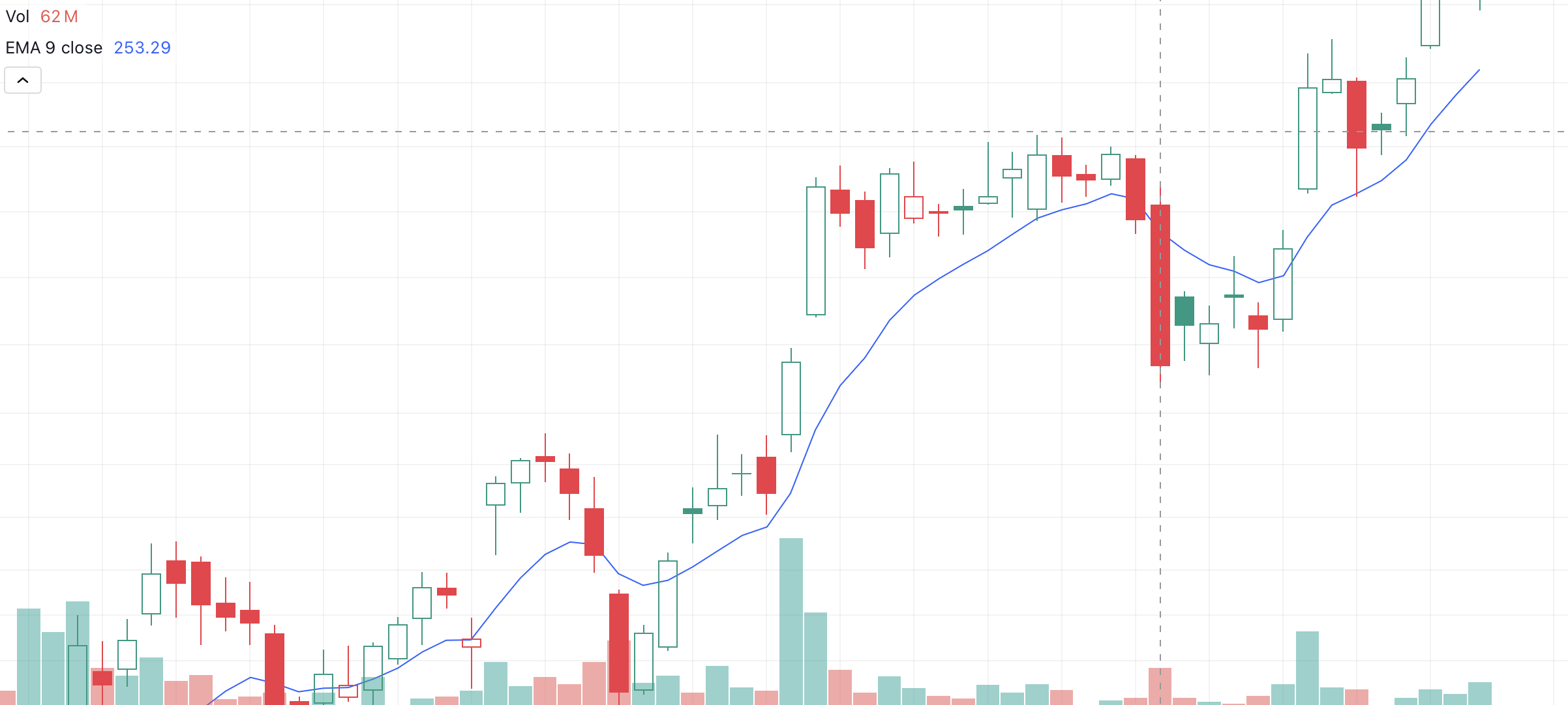
Adding Technical Indicators (Moving Averages, etc.)
Raw price data is just the start. Technical indicators can be added to enrich your charts and dashboards with trends and signals. FMP offers technical indicator endpoints that output indicator values alongside price data. For example, the Exponential Moving Average (EMA) API can compute a moving average for a given period. An EMA emphasizes recent prices, helping highlight short-term trends. A request for a 10-day EMA on daily Apple data would look like:
|
GET https://financialmodelingprep.com/stable/technical-indicators/ema?symbol=AAPL&periodLength=10&timeframe=1day&apikey=YOUR_API_KEY |
The response will include the usual OHLCV fields for each day plus an ema field for the 10-day EMA value. For example:
|
[ { "date": "2025-10-29 00:00:00", "open": 269.275, "high": 271.41, "low": 267.11, "close": 268.79, "volume": 20699917, "ema": 262.539397915946 }, { "date": "2025-10-28 00:00:00", "close": 269.00, "ema": 261.1503752306007 }, ... ] |
Here the EMA is calculated based on the prior 10 days of closing prices. You can fetch other indicators (SMA, RSI, etc.) similarly using FMP's technical indicators APIs. By retrieving indicator data along with price, you can plot the indicator (say, a moving average line) on top of your price chart for additional insight. For instance, adding a 10-day EMA line to a candlestick chart can help visualize the trend direction and potential reversal points.
Exponential Moving Average Graph
Test it out: You can try these endpoints yourself using your API key - for example, plug the above URLs into your browser or a tool like Postman. FMP's API returns JSON by default, but you can also request CSV if you plan to import directly into Excel.
Expert tip: simply add &datatype=csv to many FMP endpoints to get CSV output. Each of these data sources - daily OHLCV, intraday bars, and indicators - is chart-ready.
Next, we'll discuss how to turn this data into actual charts.
Daily vs. Intraday: Choosing the Right Time Interval
One key decision in building a clear chart is selecting the appropriate time interval for your data. Using FMP's APIs, you have access to everything from tick-by-tick intraday data to decades of daily history. Choosing the right interval will emphasize the insights you want to show and keep your chart uncluttered.
Use daily (or higher) intervals for long-term trends
If you're visualizing multiple months or years of data, daily or weekly OHLC points are ideal. They compress each trading day into one data point, smoothing out noise and making broad trends visible. For example, a dashboard showing a company's stock over five years would typically use daily closing prices or weekly averages - a 1-minute chart over 5 years would be an indecipherable blur of points. Line charts often use daily closes to show an easy-to-read trend line over long periods.
Use intraday intervals for short-term insights
When focusing on a single day or a short window of days, finer intervals like 1-minute or 15-minute are useful. They reveal the detail of intra-day price swings - crucial for day traders or during events like earnings releases. A candlestick chart on 5-minute data might show the volatility around an announcement that a daily chart could hide. Just be mindful of scope: intraday charts work best for days or weeks of data, not years.
Preparing Data for Visualization
Once you have the raw JSON data from FMP, the next step is to transform it into a format suitable for charting. This usually means organizing it into a table (rows of time points with columns for date, open, high, low, close, volume, etc.) and ensuring it's sorted chronologically. Depending on your tools and audience, there are two main routes:
Programmatic transformation (for developers/BI engineers)
If you're comfortable with a bit of coding (in Python, JavaScript, R, etc.), you can parse the JSON and feed it to a plotting library. For example, using Python's pandas and matplotlib:
|
import requests import pandas as pd # Fetch daily OHLCV data for AAPL url = "https://financialmodelingprep.com/api/v3/historical-price-full/AAPL?apikey=YOUR_API_KEY" response = requests.get(url) data = response.json() # Convert JSON into a DataFrame df = pd.DataFrame(data["historical"]) # 'historical' key holds list of daily records df = df.sort_values("date") # sort by date ascending df.set_index("date", inplace=True) print(df[["open", "high", "low", "close", "volume"]].head()) |
When this code runs, it will output a neatly tabulated DataFrame of the OHLCV data, ready for plotting or analysis. We sorted by date to ensure the timeline is in order. You could then easily plot, say, the closing price over time:
|
import matplotlib.pyplot as plt df["close"].plot(title="AAPL Closing Price") plt.xlabel("Date"); plt.ylabel("Price (USD)") plt.show() |
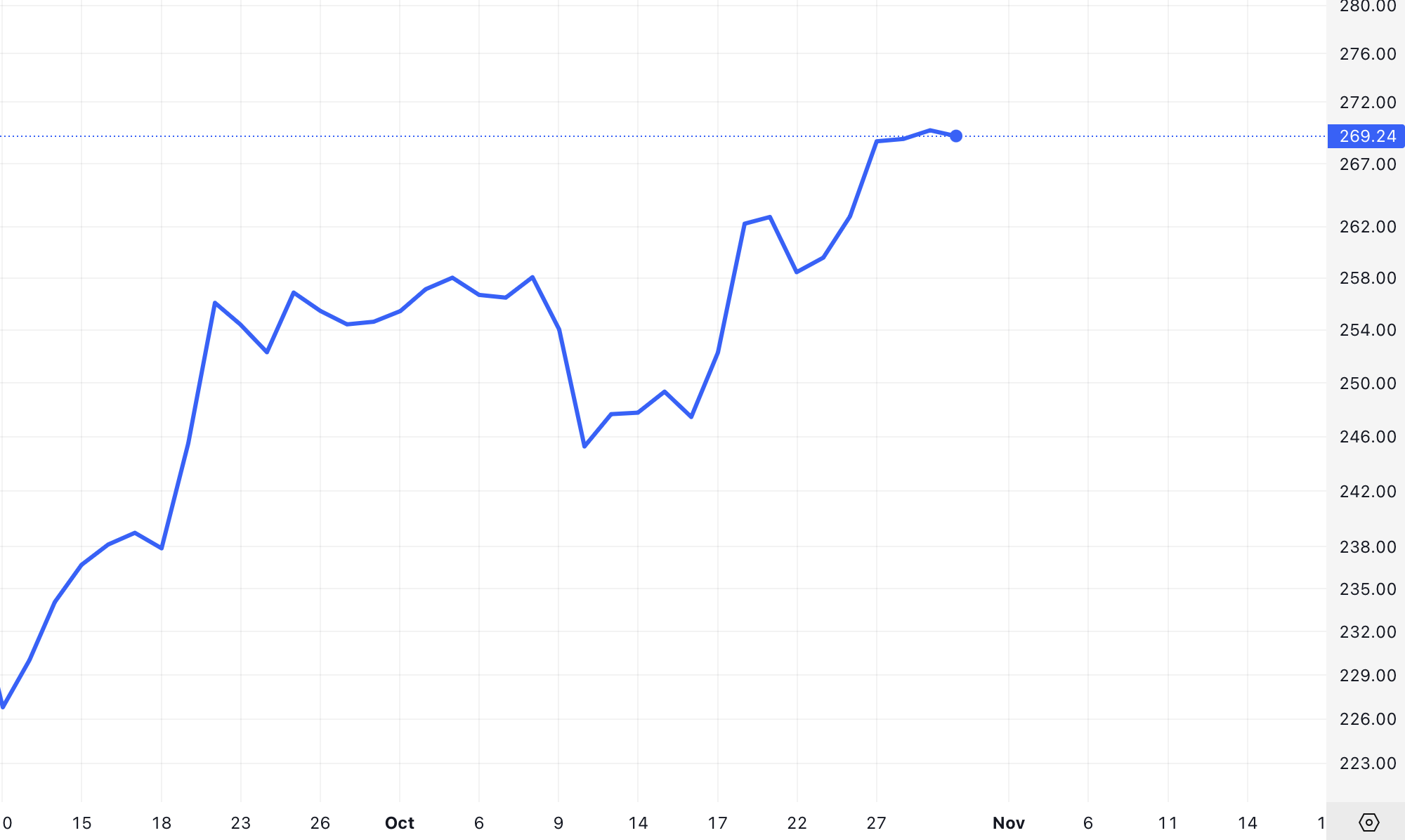
The above snippet would produce a simple line chart of Apple's closing price over the requested period. With libraries like matplotlib or Plotly, you could further create candlestick charts by using the open/high/low/close columns (many libraries have built-in candlestick chart functions or you can draw them manually). If you fetched an EMA or other indicator, you can plot that on the same chart as a separate line for comparison.
AAPL Daily Line Chart
No-code transformation (for non-developers)
You don't need to write code to prepare data. Tools like Excel, Google Sheets, or BI platforms can directly ingest the data. Many FMP endpoints support CSV output, which you can open in Excel in seconds. For example, adding &datatype=csv to the API URL will prompt a CSV download of the data, which you can save and open in Excel. Once in Excel/Sheets, ensure the data is sorted by date (oldest to newest in most cases) so that charts plot in the correct time order.
An even easier method is to use FMP's Excel/Google Sheets Add-in. FMP provides an official add-in that lets you fetch data with a simple formula instead of manually calling URLs. For instance, after installing the add-in, you could put a formula like =FMP("AAPL", "Price") in a cell to get the latest price for Apple.
There are formulas to pull historical data as well. This approach handles the API calls in the background - you just specify what you need. The benefit is your spreadsheet can refresh data on command or on a schedule, effectively becoming a live dashboard without any coding. Excel users can similarly use FMP's Excel add-in, or use Excel's “Get Data from Web” feature to link the API URL and pull data into a table.
Once your data is in a table format (whether via code or spreadsheet import), you have a chart-ready dataset. The final steps are simply choosing your chart type and feeding this data into it. Let's explore the common chart types and how to use our data in each.
Anatomy of Common Market Charts (Candlestick, Bar, Line)
Financial data can be visualized in several ways. The three most common chart types for market data are line charts, OHLC bar charts, and candlestick charts. Each uses the OHLC data differently to balance simplicity vs. detail:
Line Chart
Simple and clear. A line chart connects one price point per interval (typically the closing price) into a continuous line. This chart is great for a high-level view of the trend. It's easy to read and ideal when you want to de-emphasize short-term volatility and focus on overall direction.
For example, a line chart of closing prices over a year will show the general upward or downward trend without the distraction of intra-day swings. The trade-off is that you lose the detail of each day's high and low range - the line only shows one value per day (usually close, though sometimes people use open or an average).
OHLC Bar Chart
More detail, slightly more complex. An OHLC bar chart (often just called a bar chart in trading) shows the open, high, low, and close for each period as a vertical line with small horizontal ticks. The top and bottom of the vertical line mark the high and low. A tick on the left side marks the open price, and a tick on the right marks the close. If the close is higher than the open, the bar might be colored or just interpreted as an “up” day (and vice versa for down).
OHLC bars convey the full range of trading in the period without using a filled body. They are very information-rich (showing four data points per interval), but at a glance they're a bit harder to read than candlesticks because they lack color coding by default.
Candlestick Chart
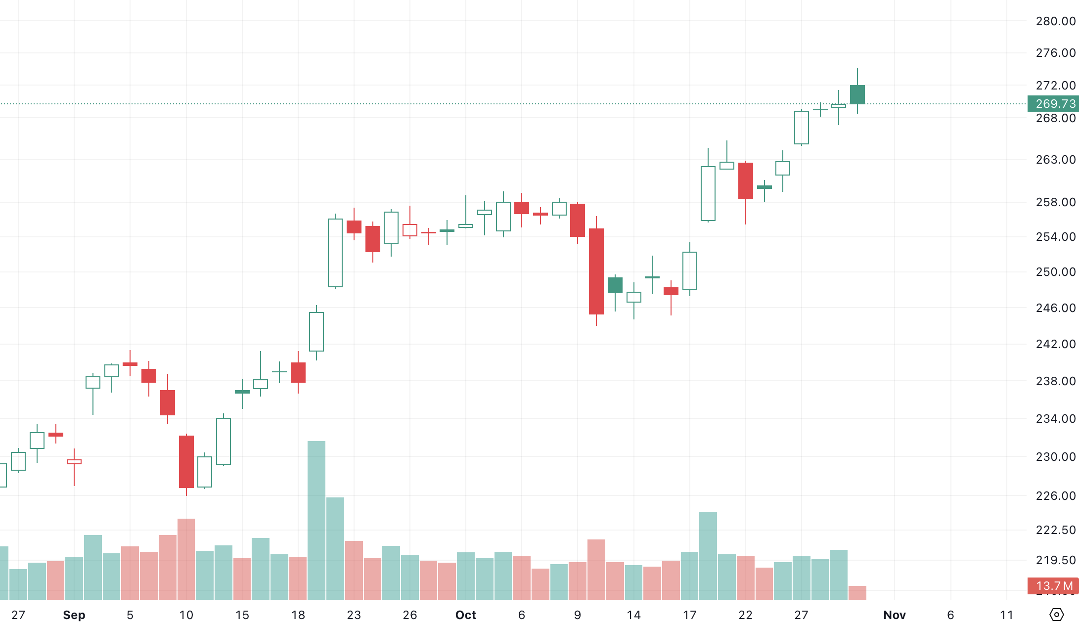
Most visual detail. A candlestick chart uses the same OHLC data as the bar chart, but presents it as a “candle”: a rectangle (the body) between the open and close, and thin lines (wicks) from the body to the high and low. Typically, the candle is colored (for example, green if the stock closed higher than it opened, red if it closed lower).
This color-coding and the filled bodies make it very easy to see at a glance whether the period was up or down and by how much. The wicks show the intra-period range. Candlesticks were popularized in Japanese trading and are beloved by many traders because they make patterns stand out visually (for instance, clusters of small-bodied candles might indicate indecision, large engulfing candles can signal reversals, etc.). In essence, candlesticks offer the same data as OHLC bars, but in a more visually intuitive way. Most modern charting libraries (and Excel) support candlestick charts given a set of OHLC data.
If you're building a dashboard for executives to quickly see performance, a line chart of the stock's close price might suffice. But if your dashboard is for traders or analysts looking for patterns, candlesticks or OHLC bars provide much more insight per time period. Often, dashboards include both: a big picture line chart and a smaller panel with candlesticks for the latest data.
Combining Price and Volume in Visuals
No market chart is complete without volume. Price and volume together provide a two-dimensional view of market activity: price shows what moved, volume shows how significant that move was. High volume often confirms that a price move is meaningful, as many participants were involved. Low volume might indicate a lack of commitment or a possible false signal. There's an old trading adage: “Volume precedes price” - a surge in volume can foreshadow a major price shift.
How to visualize volume
Volume uses a different scale (number of shares) than price, so charting tools often put volume on a separate Y-axis. In Excel, you'd create a combo chart: candlestick as one series (price axis on left) and volume as another series (volume axis on right).
The volume bars should be much shorter in height relative to price candles - they basically form a histogram along the bottom. It's common to color the volume bars in sync with the price movement for that period: e.g. green volume bar if the candle was up (close > open), and red if the candle was down. This color coding helps the reader see, for instance, that on days when the stock fell (red candle), the volume was above average - suggesting heavy selling pressure.
AAPL Daily Line Chart with Volume
Integrating FMP Data with Excel and BI Tools
FMP data can be pulled into Excel, Google Sheets, or business intelligence (BI) platforms without much hassle, enabling no-code or low-code chart building. Here are some ways to integrate:
Excel & Google Sheets Add-Ons
As mentioned earlier, FMP offers dedicated add-ins for both Excel and Google Sheets. These add-ins allow you to call the API through spreadsheet formulas. For example, in Google Sheets you might use a formula to fetch historical data into cells, then use Sheets' built-in charts.
In Excel, the add-in provides similar functions. Using these, you can create an auto-updating stock dashboard: the spreadsheet fetches latest prices or historical series on demand. From there, making a chart (line, candlestick, etc.) is the same as plotting any data in Excel. The advantage is you eliminate manual data entry - your charts always have up-to-date data pulled straight from FMP. This is ideal for presentation-oriented teams who are comfortable in Excel and want live data without writing code.
Power BI / Tableau
For more advanced BI tools, you have a couple of options. Many BI platforms can consume data from a web URL or API. For instance, in Power BI you can use the “Web” data source to connect to a JSON endpoint. You would input the FMP API URL (with your key) and Power BI will import the data, letting you refresh it on schedule.
In Tableau, you might need to use a small Python script or the Web Data Connector to fetch the JSON and pipe it into Tableau. Another approach is using CSV: schedule a job (or manually) to fetch the CSV from FMP and drop it into a database or cloud storage that your BI tool reads from.
No-Code Automation Tools
If you're not using a traditional BI suite, there are no-code tools like Make (Integromat) or Zapier. These can pull from an API and send data to Google Sheets, or even generate simple charts.
For instance, you could create a scenario where every morning Make.com pulls the latest OHLC for a set of stocks and updates a Google Sheet that has charts set up. This kind of automation is a boon for those who want fresh data visuals without manually running queries. One user-friendly approach: use the FMP API Viewer or Postman to explore endpoints, then connect Google Sheets via the add-on - no custom code needed at all.
From Data to Insights (and Alerts)
Transforming raw market data into clear, impactful visuals is a valuable skill - and FMP's APIs make it accessible to everyone. By leveraging OHLC and volume data, we can build candlestick, bar, or line charts that tell the story behind the numbers. We've learned how different endpoints (historical prices, intraday, technical indicators) provide the building blocks for these charts, and how choosing the right interval and chart type can highlight the insights we care about. We also covered how to integrate these data and visuals into tools like Excel or BI platforms, bringing the power of live market data to your everyday workflows.
With your charts and dashboards in place, the final step is to stay proactive. A logical next step is setting up alerts and notifications based on the data in your dashboard. For example, once you can visualize when a stock's price breaks above a key level or when volume spikes to unusual highs, you might want to get alerted immediately when those events happen.
Many professionals configure alerts for significant moves - and you can too, by either using FMP's alert features or building a simple monitoring script that emails/slack-notifies you. Imagine receiving an alert when your chart's 50-day moving average line crosses above the 200-day line (a golden cross), or when daily volume doubles the average - you'd know to check your dashboard right away. By adding such custom alerts and notifications, you ensure that your beautifully crafted dashboard is not just passive, but an active tool to stay ahead of market fluctuations.
In summary, getting data to build market charts is no longer a barrier. With FMP's data at your fingertips and the techniques discussed, you can create professional, presentation-ready charts and dashboards that bring clarity to the chaos of market data. Use these insights to make better decisions, impress stakeholders with visual evidence, and ultimately, to tell the story behind every price movement.
FAQs
What is OHLC data and why is it important for market charts?
OHLC stands for Open-High-Low-Close, the four key price points in a trading interval. This data is crucial because it captures the full price range and outcome for each period. Charts like candlesticks and bar charts rely on OHLC to show not just where price ended up, but how far it swung high or low and where it started. Using OHLC data lets analysts see patterns (like price gaps, trends, or volatility) that a single price point wouldn't reveal.
How can I retrieve stock price data for charting without being a developer?
Financial Modeling Prep provides easy options for non-developers. You can use their Excel or Google Sheets add-ins to fetch data with simple formulas (no coding). For example, you can enter a formula to get historical prices for a stock directly into your spreadsheet. Another option is to copy-paste API URLs into your web browser - the data will download as JSON or CSV which you can open in Excel. There are also no-code tools (like certain automation platforms) that can pull API data and feed it into Google Sheets for you. In short, you don't have to write code - you can leverage these integrations to get the data ready for visualization.
Candlestick vs. line chart: when should I use each?
Use a line chart when you want simplicity and a focus on the trend of one price (usually the close) over time - for example, showing the overall upward or downward trajectory of a stock over a year. Line charts are great for presentations to a broad audience because they're clean and easy to read, highlighting the big picture trend. On the other hand, use a candlestick chart when you need to analyze or display detailed trading information for each period - for instance, in a daily stock analysis or technical trading scenario. Candlesticks show the open, high, low, close in one visual, which can reveal daily market sentiment and patterns (like reversals or continuations) that a line chart might hide. In practice, many dashboards use line charts for long-term overview and candlesticks for shorter-term deep dives.
What's the best interval for my stock chart - 1 minute, 15 minute, daily?
It depends on your analysis needs. For intraday monitoring or day trading insights, a 1-minute or 5-minute interval chart lets you see fine-grained movements (each bar shows a tiny slice of the day). For short-term trends(days to weeks), 15-minute or 1-hour charts can be effective, as they compress an hour's action into one bar, reducing noise but still capturing intraday patterns. For medium to long-term views (months or years), daily or weekly intervals are best - they give a clean view of overarching trends without overwhelming detail.
How do I add technical indicators like moving averages to my charts?
There are two ways: have the data pre-calculated or calculate it within your tool. FMP's Technical Indicators API can return values like moving averages (SMA, EMA), RSI, MACD, etc., alongside price data. You can fetch, say, a 10-day EMA for your stock via the API, then plot that EMA line on your chart (usually as a line overlay on a candlestick or line chart).
How do volume bars enhance a stock chart?
Volume bars add a crucial dimension: they tell you how much trading activity corresponded to the price moves. This is important for interpreting the strength of a move. For instance, if a stock's price jumps 5% on very high volume, it's a strong signal that many traders drove it (possibly a significant event). If it jumps 5% on tiny volume, it could be an anomaly or easily reversed. By plotting volume as bars below the price chart (one bar per period, aligned in time), you can see these patterns at a glance.

WACC vs ROIC: Evaluating Capital Efficiency and Value Creation
Introduction In corporate finance, assessing how effectively a company utilizes its capital is crucial. Two key metri...

BofA Sees AI Capex Boom in 2025, Backs Nvidia and Broadcom
Bank of America analysts reiterated a bullish outlook on data center and artificial intelligence capital expenditures fo...

Pinduoduo Inc. (PDD) Q1 2025 Earnings Report Analysis
Pinduoduo Inc., listed on the NASDAQ as PDD, is a prominent e-commerce platform in China, also operating internationally...