FMP
Multi-Timeframe Returns: Power Your Trades with FMP's Stock Price Change API
Feb 03, 2026(Last modified: Feb 09, 2026)
Understanding how a stock's price changes over various periods is crucial for determining entry points, sizing positions, and managing risk. It transforms raw price data into meaningful insights, revealing trends, reversals, and regime shifts that might be concealed when looking at prices alone.
Price change metrics across various timeframes turn a basic quote into a concise performance profile. Short-term movements show how the market responds to new information and liquidity shocks, whereas longer durations highlight ongoing trends, cycles, and shifts in sentiment. Collectively, these metrics assist traders, quants, and portfolio managers in aligning their decisions with immediate momentum and long-term beliefs.
Endpoint Overview
The FMP Stock Price Change API offers real-time percentage returns over 11 different timeframes—from 1 day to maximum—for any ticker in a single JSON request. Ideal for dashboards, screeners, and momentum strategies, it delivers instant performance snapshots across multiple horizons without requiring complex calculations.
To call the specific endpoint, you will need:
- api-key: your api key
- symbol: the symbol you are interested in. In the example Python code below, we will request the stock quote of Google stock (GOOG).
|
import requests symbol = 'GOOG' apikey = 'YOUR FMP API KEY' url = 'https://financialmodelingprep.com/stable/stock-price-change' querystring = {"apikey":apikey, "symbol":symbol} resp = requests.get(url, querystring).json() resp |
Note: Replace ‘YOUR FMP API KEY' with your secret FMP token. If you don't have one, you can obtain it by opening an FMP developer account.
Calling this endpoint, you will get a list of a dictionary with the changes as below:
|
[{'symbol': 'GOOG', '1D': 2.1344, '5D': 4.4659, '1M': 6.50241, '3M': 28.76281, '6M': 72.83594, 'ytd': 6.38082, '1Y': 73.11245, '3Y': 238.28157, '5Y': 249.92698, '10Y': 840.92567, 'max': 13317.6}] |
If we want to interpret the above response, we could group the timeframes as below:
|
Timeframe Category |
Specific Periods & Returns |
Strategic Insight & Interpretation |
|
Short-Term |
1D: +2.13% |
Momentum Play: Suggests news digestion and liquidity support. Ideal for tactical entries if volume confirms the move. |
|
Medium-Term |
1M: +6.50% |
Trend Confirmation: Accelerating strength signals a sustained uptrend. Watch for pullbacks as potential profit-taking zones. |
|
Long-Term |
1Y: +73.11% |
Structural Dominance: Exceptional compounding reflects long-term market leadership; qualifies as a "core holding" candidate. |
|
YTD |
+6.38% |
Annual Benchmark: Resets Jan 1; crucial for performance attribution and comparing against indices (like the S&P 500). |
Now, let's explore what additional interesting information we can gather using this endpoint.
Plot a Barchart With the Quote Changes
A visual depiction of the return is always more effective than the raw dictionary response, so let's create an appealing bar chart.
|
import matplotlib.pyplot as plt import pandas as pd data = resp[0] if isinstance(resp, list) else resp plot_data = pd.Series({k: v for k, v in data.items() if k != 'symbol'}) plt.figure(figsize=(12, 6)) colors = ['green' if x >= 0 else 'red' for x in plot_data.values] bars = plt.bar(plot_data.index, plot_data.values, color=colors) # Set symmetric log scale to handle extremes plt.yscale('symlog') # Add values on top/bottom of bars for bar in bars: yval = bar.get_height() plt.text(bar.get_x() + bar.get_width() / 2, yval, f'{yval:.2f}%', va='bottom' if yval > 0 else 'top', ha='center', fontsize=9, fontweight='bold') plt.title(f"Stock Price Change for {data.get('symbol', symbol)} (%)") plt.ylabel("Change (%) - Symlog Scale") plt.xlabel("Period") plt.grid(axis='y', linestyle='--', alpha=0.7) plt.axhline(0, color='black', linewidth=0.8) plt.tight_layout() plt.show() |
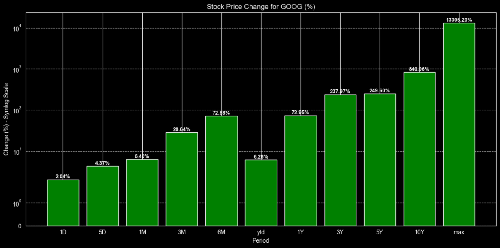
The first tip we can mention is that we use a log scale. This is because, if we simply plot the max, which is around 13000%, alongside the daily or weekly changes (less than 5%), we wouldn't be able to see the difference, as those bars would be extremely small compared to the max one. Using a logarithmic scale prevents that and provides a clearer plot.
Additionally, the code will display the data in red if the change is negative. We can see below the same plot for Tesla to illustrate our point.
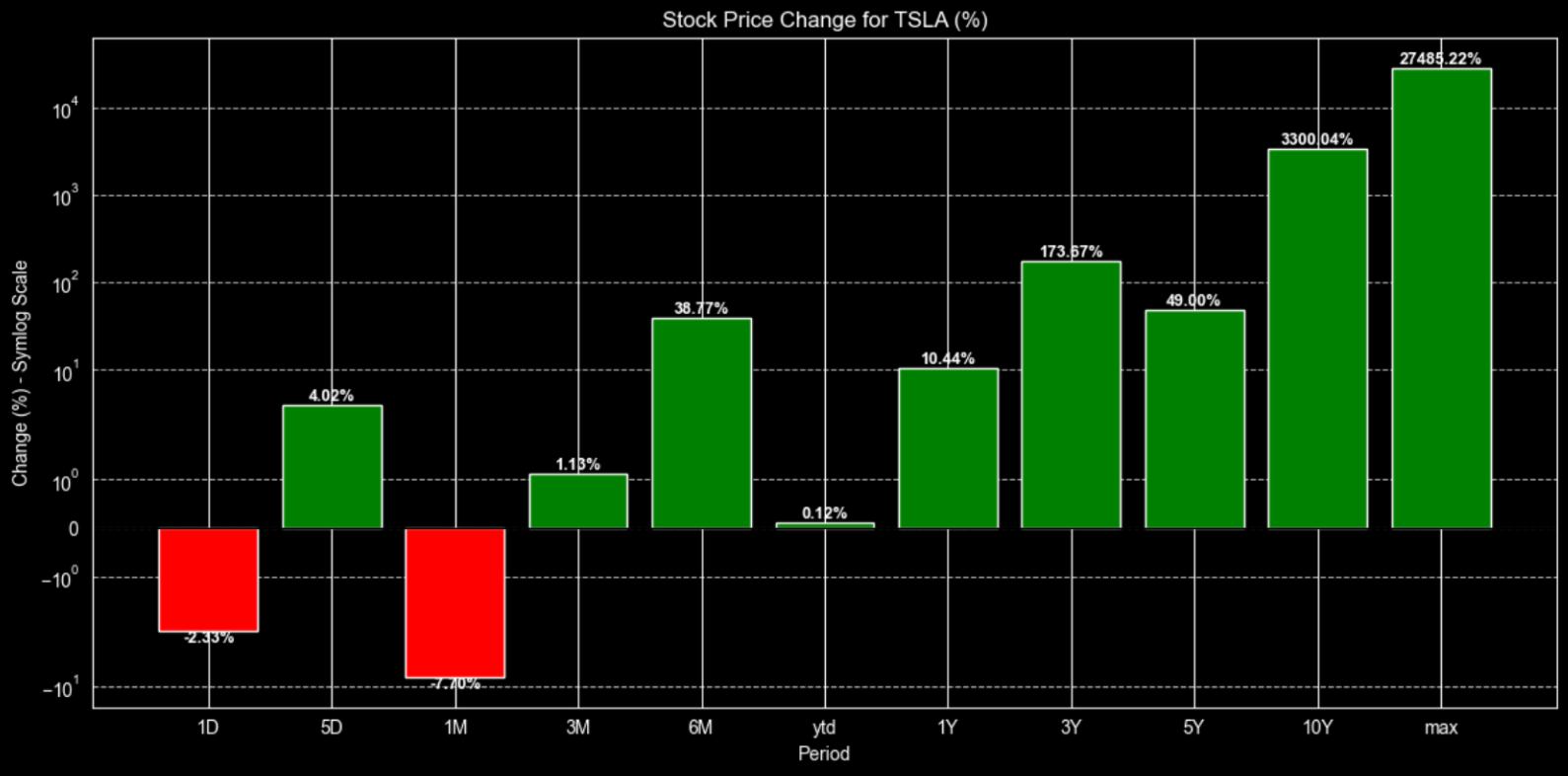
As expected for Tesla, there is a mix of changes (both negative and positive) with varied returns in the short-term timeframes, which indicates volatility and apparent risk.
Find the Opportunities
Stock screeners revolutionize investing by rapidly filtering thousands of stocks according to your criteria—such as momentum, valuation, and volume. They uncover hidden opportunities, rank stocks through various metrics, and save hours of manual research, allowing traders and analysts to make data-driven decisions instead of relying solely on instinct.
Combining FMP's Stock Screener API with the Stock Price Change API develops an effective momentum-ranking system. First, select a group of stocks meeting specific criteria, then enhance each with returns over multiple timeframes. Rank these stocks based on combined scores across 1-month, 6-month, and 1-year changes to identify those with accelerating performance. This approach allows for creating dynamic watchlists or setting up automated alerts within a single, efficient workflow.
Let's begin. As an example, we will retrieve all stocks with a market capitalization exceeding 100 billion that are traded on the NASDAQ stock exchange.
Note: The Stock Screener API is available only on paid plans, as it's designed for more advanced filtering and workflows. If you want to screen at scale or build more precise, repeatable strategies, it's worth exploring the higher-tier plans to unlock that full capability.
|
url = f'https://financialmodelingprep.com/stable/company-screener' querystring = {"apikey":apikey, "marketCapMoreThan":100_000_000_000, "exchangeShortName":"NASDAQ", "isEtf":False, "isFund":False, "isActivelyTrading":True} resp = requests.get(url, querystring).json() df_screener = pd.DataFrame(resp) df_screener |
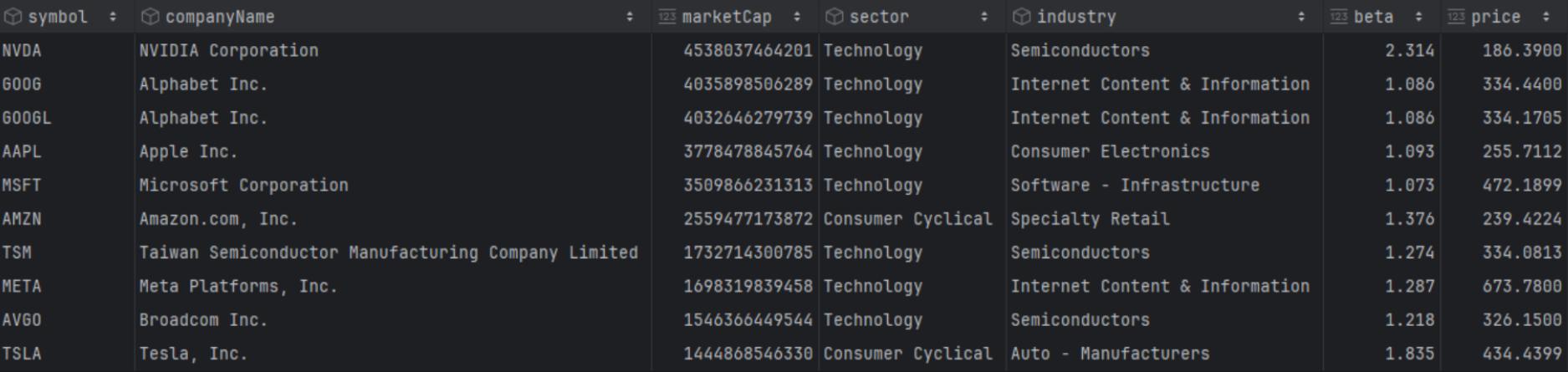
This approach ensures that the df_screener dataframe contains extensive information about those stocks, such as Sector, Industry, Volume, Beta, and more.
Next, we will combine this with the information from the quote change API. Interestingly, we will create a string with all the stock symbols from the screener, separated by commas, and pass it as a parameter to the API. This way, the return will include the changes for all 171 stocks, which we will be able to add to the screener dataframe.
|
symbols = ",".join(df_screener['symbol'].tolist()) url = 'https://financialmodelingprep.com/stable/stock-price-change' params = {"apikey": apikey, "symbol": symbols} resp = requests.get(url, params=params).json() # Convert the performance data to a DataFrame and merge it with df_screener df_performance = pd.DataFrame(resp) df_screener = pd.merge(df_screener, df_performance, on='symbol', how='left') |
Now the screener dataframe includes changes across all time frames, allowing us to easily query and obtain any results we need. For example, the code below will retrieve the top 10 stocks with the largest positive change over the last month.
|
top_10_tech = df_screener[df_screener['sector'] == 'Technology'].sort_values('1M', ascending=False).head(10) top_10_tech[['symbol','companyName','1M']] |
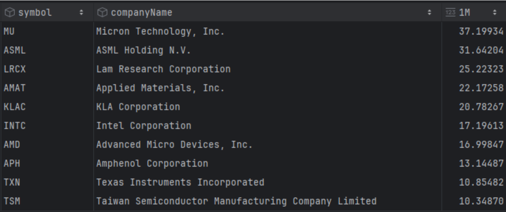
We can see that Micron Technologies had the largest return last month, along with other technology firms like Intel, AMD, Texas Instruments, etc.
But what about combining rankings across different timeframes? A useful trick is to update the dataframe with the ranking for each timeframe, using the code below. This will generate ranking columns such as 1M_rank, 1Y_rank, 5Y_rank, and so on.
|
rank_columns = ['1D', '5D', '1M', '3M', '6M', 'ytd', '1Y', '3Y', '5Y', '10Y', 'max'] # Create new columns with the suffix _rank using descending rank (highest performance = rank 1) for col in rank_columns: df_screener[f'{col}_rank'] = df_screener[col].rank(ascending=False, method='min') |
Now we can execute combined queries. In our example, we will try to identify which stocks consistently rank in the top 10 for short-term timeframes from 1 day to 1 month.
|
# Query for stocks that are in the top 10 rank for all specified timeframes target_ranks = ['1D_rank', '5D_rank', '1M_rank'] top = 10 top_consistent = df_screener[ (df_screener[target_ranks] <= top).all(axis=1) ] # Display the consistent top performers top_consistent[['symbol', 'companyName'] + target_ranks] |

Interestingly enough, out of all the stocks in our screener, only Novo Nordisk consistently ranks in the top 10 for most changes. This consistency is a powerful signal, especially when paired with a deeper dive into the business, you can get started by following our guide on which financial data to prioritize for your analysis.
A Picture is Worth a Thousand Words
Time is money, and plots that can provide quick and reliable answers with a single image are invaluable. Using the seaborn library and its heatmap, we can see where all the stocks stand in their timeframes rankings.
|
import seaborn as sns # Define the performance timeframes we want to visualize timeframes = ['1D_rank', '5D_rank', '1M_rank', '3M_rank', '6M_rank', '1Y_rank'] # Select the top 25 symbols by market cap for a readable heatmap # df_heatmap = df_screener.head(25).set_index('symbol')[timeframes] df_heatmap = df_screener[df_screener['sector'] == 'Technology'].sort_values('1M_rank', ascending=True).head(25).set_index('companyName')[timeframes] # Plotting the heatmap plt.figure(figsize=(14, 10)) sns.heatmap(df_heatmap, annot=True, cmap='RdYlGn_r', center=0, fmt=".1f", linewidths=.5) plt.title("Stock Performance Heatmap: Symbols vs Timeframes (rank)", fontsize=16) plt.xlabel("Timeframe", fontsize=12) plt.ylabel("Symbol", fontsize=12) plt.show() |
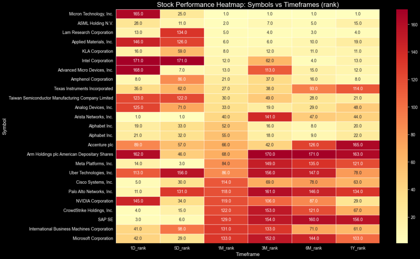
The more yellow, the higher in the ranking the changes are based on the timeframe. So, with just one plot, we can easily gather information such as:
- At the top right corner, we have stocks like Micron, Intel, AMD, that in the longer timeframes are consistently top-ranked,
- However, in the bottom left, stocks like Uber, CrowdStrike, SAP, etc., that are consistently ranking high in the shorter timeframes while they were lagging in the longer ones, indicate a possible start of a rally.
Comparing stocks rather than just single company data is always key to finding the right opportunity. To refine your strategy, explore our guide on how to compare companies fairly across different market caps and valuations. Imagine combining those relative valuation insights with the multi-timeframe rankings discussed in this article to build a truly robust investment thesis!
In the scope of an article, we will plot the top 25-ranked technology companies for the 1M timeframe. This is because displaying all 171 companies in a single image would be overwhelming. However, feel free to modify the code and include all the stocks. It is just that, as an image in an article, it would have no value.
Are the Analysts Spot On?
The quote changes API can provide us with insights and verify data when used alongside other FMP APIs. For instance, we will examine whether the analysts' ratings align with the stock's price movements over different time frames.
First, we will further enhance the screener dataframe using the FMP's Ratings Snapshot API, with the value of the overall score.
|
rating_scores = [] for symbol in df_screener['symbol'].tolist(): url = 'https://financialmodelingprep.com/stable/ratings-snapshot' params = {"apikey": apikey, "symbol": symbol} try: resp = requests.get(url, params=params).json() if resp and isinstance(resp, list): rating_scores.append({ 'symbol': symbol, 'overallScore': resp[0].get('overallScore') }) except Exception as e: print(f"Error fetching rating for {symbol}: {e}") # Create a temporary DataFrame with the scores and merge it with df_screener df_ratings = pd.DataFrame(rating_scores) df_screener = pd.merge(df_screener, df_ratings, on='symbol', how='left') |
Next, we will examine the relationship between each timeframe and the analysts' overall score.
|
timeframes = ['1D', '5D', '1M', '3M', '6M', '1Y'] corrs = df_screener[['overallScore'] + timeframes].corr()['overallScore'].drop('overallScore') sorted_corrs = corrs.abs().sort_values(ascending=False) print("Correlations sorted by strength:\n", sorted_corrs) print("Strongest:", sorted_corrs.index[0], corrs[sorted_corrs.index[0]]) |
The results are the below:
|
Correlations sorted by strength: 5D 0.162202 1M 0.132045 3M 0.115429 1D 0.078337 6M 0.048564 1Y 0.039924 |
Apparently, we would not expect high correlations, but what is interesting is that the changes over shorter time frames are more correlated than the longer ones. In fact, they are perfectly aligned/sorted, with the stronger correlation in the 5-day timeframe, moving down to the longer one, which is the one-year timeframe. This means analysts are keeping up with prices, and a high overall score would indicate better expectations in the short term. Also, you can try to find opportunities, for example, stocks with high overall scores that have not yet started their rally.
Final Thoughts
FMP's Stock Price Change API is essential for modern trading and analysis. It provides 11 key return periods—from intraday shocks to decade-long growth—within a simple JSON response. This removes the need for manual calculations, offering quick multi-timeframe insights that highlight momentum, regime changes, and relative strength without requiring full price histories.
Quants use it for strategy development, screeners, and combined signals; traders rely on it for swift opportunity detection; analysts utilise it to validate ratings or create dynamic watchlists. Fully compatible with FMP's ecosystem—including screener, ratings, and historical data—it supports scalable pipelines, dashboards, and algorithms with dependable, real-time data. This efficiently transforms raw quotes into actionable insights.

Top 5 Defense Stocks to Watch during a Geopolitical Tension
In times of rising geopolitical tension or outright conflict, defense stocks often outperform the broader market as gove...

Circle-Coinbase Partnership in Focus as USDC Drives Revenue Surge
As Circle Internet (NYSE:CRCL) gains attention following its recent public listing, investors are increasingly scrutiniz...

LVMH Moët Hennessy Louis Vuitton (OTC:LVMUY) Financial Performance Analysis
LVMH Moët Hennessy Louis Vuitton (OTC:LVMUY) is a global leader in luxury goods, offering high-quality products across f...