


Analyst rating changes are easy to overstate and easy to misuse. Stock grades are not predictive signals. Their value is that they help analysts organize how the sell side is classifying a company at a given point in time.
That makes grading data useful as a dataset, not a shortcut. It tells you who changed their view, how they labeled the stock, whether the action was an upgrade, downgrade, or maintenance call, and when that change was recorded. Financial Modeling Prep's Stock Grades API is built for exactly that workflow: retrieving the latest analyst grades for a symbol in a structured format.
For analysts, this matters because stock grades sit in a different category than price targets or earnings estimates. A grade is a classification label. It reflects how a firm frames its stance on the stock, often within its own internal rating system. That makes the dataset especially useful for monitoring opinion distribution, comparing changes over time, and building dashboards that show how firms are currently positioned.
What stock grades actually represent
A stock grade is an analyst label such as Outperform, Neutral, or Underweight. In the sample response below, those are the exact kinds of labels returned, along with the analyst firm and the action taken.
That distinction is important because analyst firms do not all use identical vocabularies. One firm may use Buy and Hold. Another may use Overweight and Equal Weight. Another may prefer Outperform and Underperform. Those labels often point in a similar direction, but they are not perfectly standardized across the industry.
That is why grading data should be treated first as a categorization layer. Before you compare firms, aggregate counts, or visualize sentiment, you usually need a normalization step so the data can be aggregated, compared, and visualized consistently across firms.
|
A simple way to think about it is this:
|
This does not erase nuance, and it should not. It simply gives you a consistent framework for cross-firm comparison.
Why analysts use grading datasets
Grades are most useful when they answer a descriptive question.
|
For example:
|
Those are good analytical questions because they focus on classification and dispersion. They do not assume that a positive label guarantees future returns. That is the right posture. Grades can add context to a research process, but they should not be treated as predictive signals on their own.
The endpoint to use
To retrieve stock grades from Financial Modeling Prep, use:
https://financialmodelingprep.com/stable/grades?symbol=AAPL&apikey=YOUR_API_KEY
This endpoint is best suited to per-symbol analysis, especially on the free tier where symbol coverage is limited. That makes it a strong fit for company-level dashboards, monitoring workflows, and focused analyst research rather than broad market scanning under the free plan.
To get started, create a free account on Financial Modeling Prep. After signing up, you can find your API key in the Dashboard under API Keys, then append it to the request as apikey=YOUR_API_KEY.
A response looks like this:
Stock Grades API Endpoint
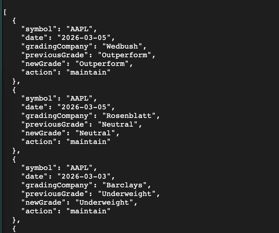
Each row is straightforward:
- symbol: the stock ticker
- date: when the grade record was published
- gradingCompany: the firm issuing the grade
- previousGrade: the prior label
- newGrade: the current label
- action: whether the rating was maintained, upgraded, or downgraded
That structure is useful because it separates the label itself from the change event. Analysts often care about both.
How to fetch the data
In most workflows, the process is simple.
First, choose a symbol. Second, call the endpoint with your API key. Third, parse the returned array. From there, you can group records by newGrade, by gradingCompany, by action, or by date.
The cleanest first use case is usually a grade-distribution view for one company. That gives you an immediate read on how labels are spread across firms without forcing a directional conclusion.
Here is a short JavaScript example:
This same pattern can be reused to build dashboards, alerts, or reporting views from the same grading dataset.
|
const apiKey = "YOUR_API_KEY"; const symbol = "AAPL"; function normalizeGrade(grade = "") { const g = grade.toLowerCase(); if (["buy", "strong buy", "outperform", "overweight", "accumulate"].includes(g)) {return "positive";} if (["hold", "neutral", "equal weight", "market perform"].includes(g)) {return "neutral";} if (["sell", "underperform", "underweight", "reduce"].includes(g)) {return "negative"; } return "other";} async function getGradeDistribution() { const url = `https://financialmodelingprep.com/stable/grades?symbol=${symbol}&apikey=${apiKey}`; const response = await fetch(url); if (!response.ok) { throw new Error(`HTTP error: ${response.status}`);} const grades = await response.json(); const rawDistribution = {}; const normalizedDistribution = { positive: 0, neutral: 0, negative: 0, other: 0}; for (const row of grades) {const raw = row.newGrade || "Unknown"; rawDistribution[raw] = (rawDistribution[raw] || 0) + 1; const bucket = normalizeGrade(row.newGrade); normalizedDistribution[bucket] += 1;} console.log("Raw grade distribution:", rawDistribution); console.log("Normalized distribution:", normalizedDistribution);} getGradeDistribution().catch(console.error); |
This example does two useful things.
First, it shows the raw labels exactly as they come back from the API. That preserves the original analyst language. Second, it maps those labels into broader buckets so you can compare firms on a more standardized basis.
For many analyst dashboards, both views matter. The raw labels preserve detail. The normalized buckets make the data easier to summarize.
How grading scales work across analysts
This is the part many workflows miss. Normalization is required before you can compare grades across firms at scale.
Analyst scales often look similar on the surface, but they are not always identical in meaning, threshold, or portfolio context. Outperform from one firm is not necessarily a perfect one-for-one match with Overweight from another. Even when both are broadly positive, they can reflect different house methodologies.
That is why the best practice is usually to separate the workflow into two layers.
- The first layer is source-faithful: keep the original label exactly as published. This is important for auditability and for any dashboard where users may want to see the analyst firm's exact wording.
- The second layer is normalized: map labels into common buckets such as positive, neutral, and negative. This is important for distribution analysis, trend reporting, and summary visuals.
|
That two-layer approach is especially helpful when you want to answer questions like:
|
Those are classification questions. Grading data handles them well.
A practical use case: display grade distributions for a company
The same panel design can also be reused across multiple companies to create a consistent analyst sentiment layer across a portfolio or watchlist.
Suppose you are building a company dashboard for internal research.
One panel can show the latest grade distribution for a symbol. Another can show the most recent actions by firm. A third can highlight whether the latest flow is dominated by maintained ratings or actual upgrades and downgrades.
That kind of view is useful because it adds structure to analyst commentary. Instead of reading notes one by one, you can see the distribution of opinion in one place.
For example, if a stock shows mostly neutral labels with a small positive cluster, that tells you something about positioning across firms. If the distribution is split between positive and negative buckets, that tells you something else: not conviction, necessarily, but disagreement.
Again, the point is not to turn the chart into a trading rule. The point is to make analyst classification data easier to inspect, compare, and communicate.
Free plan coverage and when to upgrade
The free workflow is useful for testing, prototyping, and smaller per-symbol analyst tools. The same pricing table shows broader access on higher tiers, including US exchange coverage, then wider regional coverage, and in some tiers full global coverage. In other words, the free plan is suitable for getting started, but broader symbol coverage comes with higher plans.

That matters if your workflow starts with a handful of names and later expands into sector-wide or cross-market monitoring.
So the practical framing is simple: use the free plan to validate your logic and build the first version of the workflow. If your team needs a wider universe, upgrade to a higher plan for broader coverage. FMP's Stock Grades documentation also explicitly positions free access as the starting point (limited to certain tickers) and premium access as the path to broader datasets.
Where this dataset fits in an analyst stack
Stock grades are not a forecasting tool. They are a structured view of how analyst firms are labeling a stock right now.
That makes them useful alongside other datasets, not instead of them. In practice, grades work best when paired with estimate history, price target data, earnings calendar, or company fundamentals. On their own, they tell you how a stock is being categorized. In combination, they help you understand whether classification, estimates, and broader analyst framing are moving together.
That is the right way to use the endpoint: as a clean input for analyst monitoring, sentiment classification, and research dashboards.
FAQ
What does the Stock Grades API return?
The Stock Grades API returns a list of analyst rating records for a given symbol. Each record includes the analyst firm, the previous grade, the new grade, the action taken, and the date of the update.
Why do analysts use stock grading data?
Analysts use grading data to organize how the sell side is classifying a company at a given moment. It is especially useful for tracking opinion distribution, comparing firms, and adding structured context to a research dashboard.
Are analyst grades standardized across firms?
No. Different firms use different rating vocabularies, such as Buy, Outperform, Overweight, or Neutral, and those labels are not always exact equivalents. That is why many workflows preserve the original label and also map grades into broader normalized buckets.
Should stock grades be treated as predictive signals?
No. Stock grades are best used as descriptive inputs that show how analysts are categorizing a stock, not as standalone indicators of future performance. They can add context to a broader process, but they should not be treated as direct forecasting signals.
What is a practical first use case for this endpoint?
A strong first use case is displaying grade distributions for a company. That lets you show how many firms are currently positive, neutral, or negative on a name, while also preserving the original rating labels for detail.
What should users know about the free plan?
Under the free plan, the Stock Grades API has limited symbol coverage, for example a narrower set of tickers for smaller-scale workflows. That makes it best suited for testing, prototyping, and focused company analysis. Users who upgrade to a higher plan get broader coverage, which is more practical for larger analyst tools and wider market monitoring.